14th Street is the place to be!
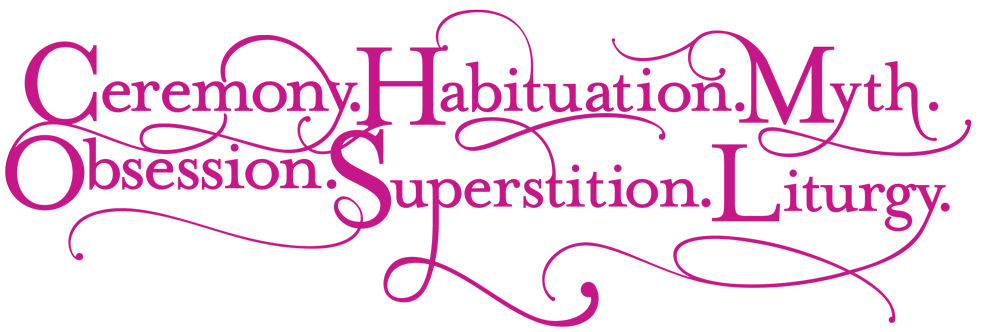
Every year you can find the AIOP festival anywhere on 14th street. It's a great exhibition of many types of art and people across NYC. I had the opportunity to work with Ed, the head of AIOP, for several years (2011 – 2017, 2019) designing and building websites, festival taglines such as the illustrations for "Ceremony, Habituation, Myth, Obsession, Superstition, Liturgy", magazine ads, and print collaterals.
Here are a few examples of what I created during my time with AIOP.
Websites
2011 Ritual
I started in 2011 with the Ritual festival site. I was learning PHP at the time, and built this on a fully custom PHP CMS I developed.
2012 MODEL

For the following year, I improved a lot of the internal mechanics of the CMS.
2013 Number

2013 was a big year for AIOP. We migrated to a Wordpress CMS for the main site and the festival site. Responsive web design was all the rage, so this was the first fully responsive site I built. I also integrated a now-defunct Google map with all events listed as pins, a calendar from scratch, and the random number generator in the banner. A lot of this page has become inoperable from lack of back support, but back in the day, it got me a Webby Honoree!
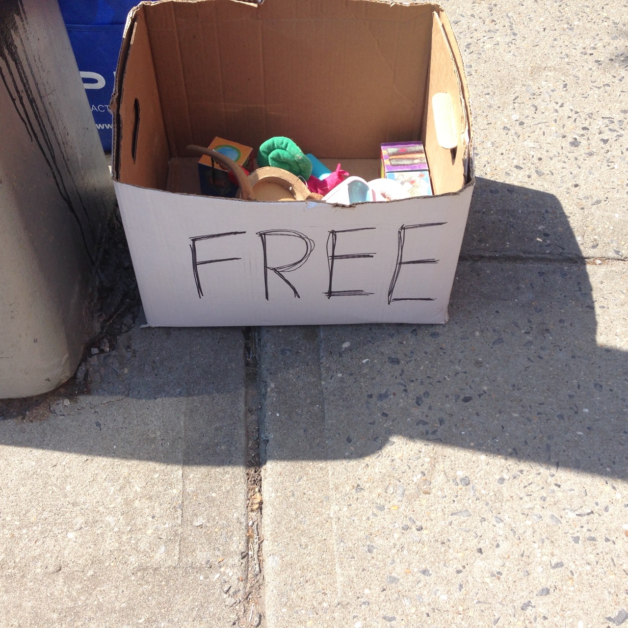
2014 Free
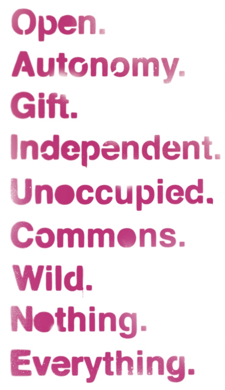
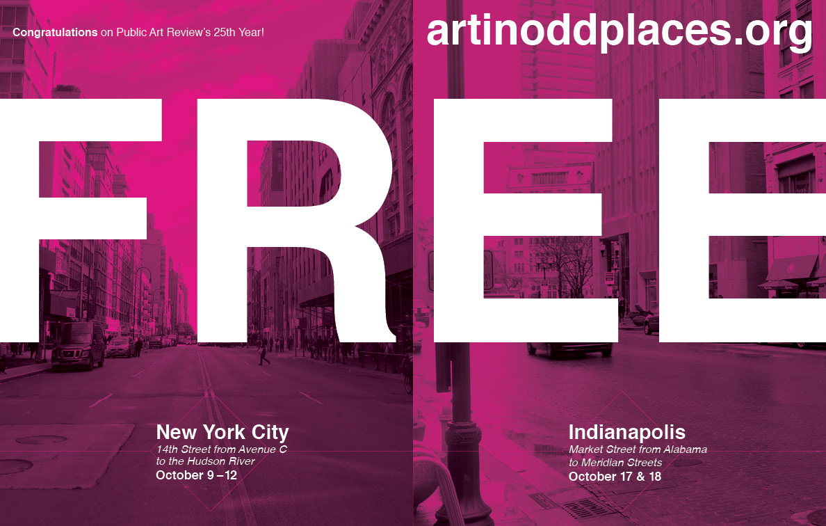
Riding on my high from the Webby, I swung for the fences on this one. I really liked the Map section from Number, so I designed the entire site around the map of 14th street, with a live tracker, so you could see your place on 14th street during the festival. I added a Live Tumblr and Flickr feed (boy that dates it huh?). I also integrated the calendar and map, so as you updated the calendar dates, the map would update. Due to Google Map API updates and restrictions, a lot of this is no longer operable. It was really cool back in the day though. I also created a lot of brand collaterals you can see further down the page. This is one of my favorite years and one our most successful, which I like to think my branding helped with.
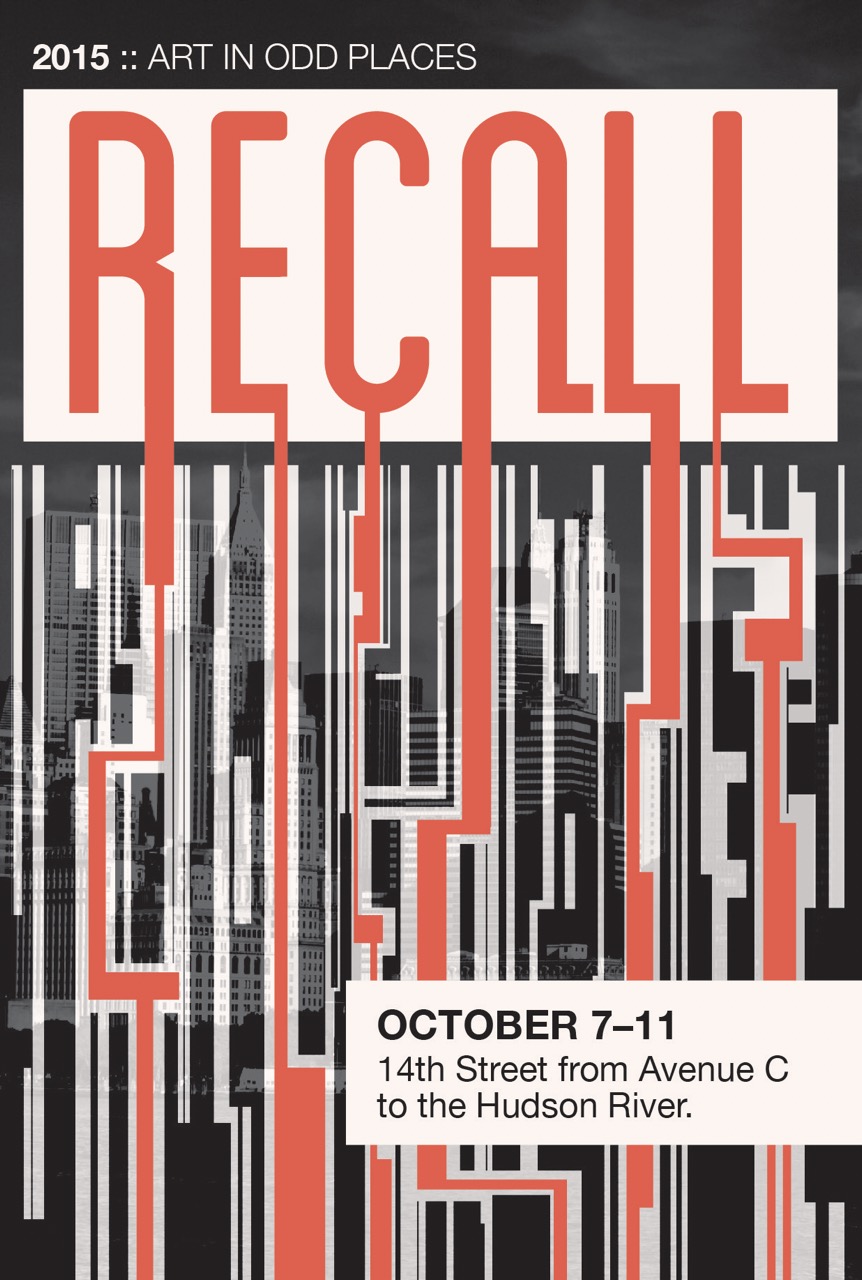
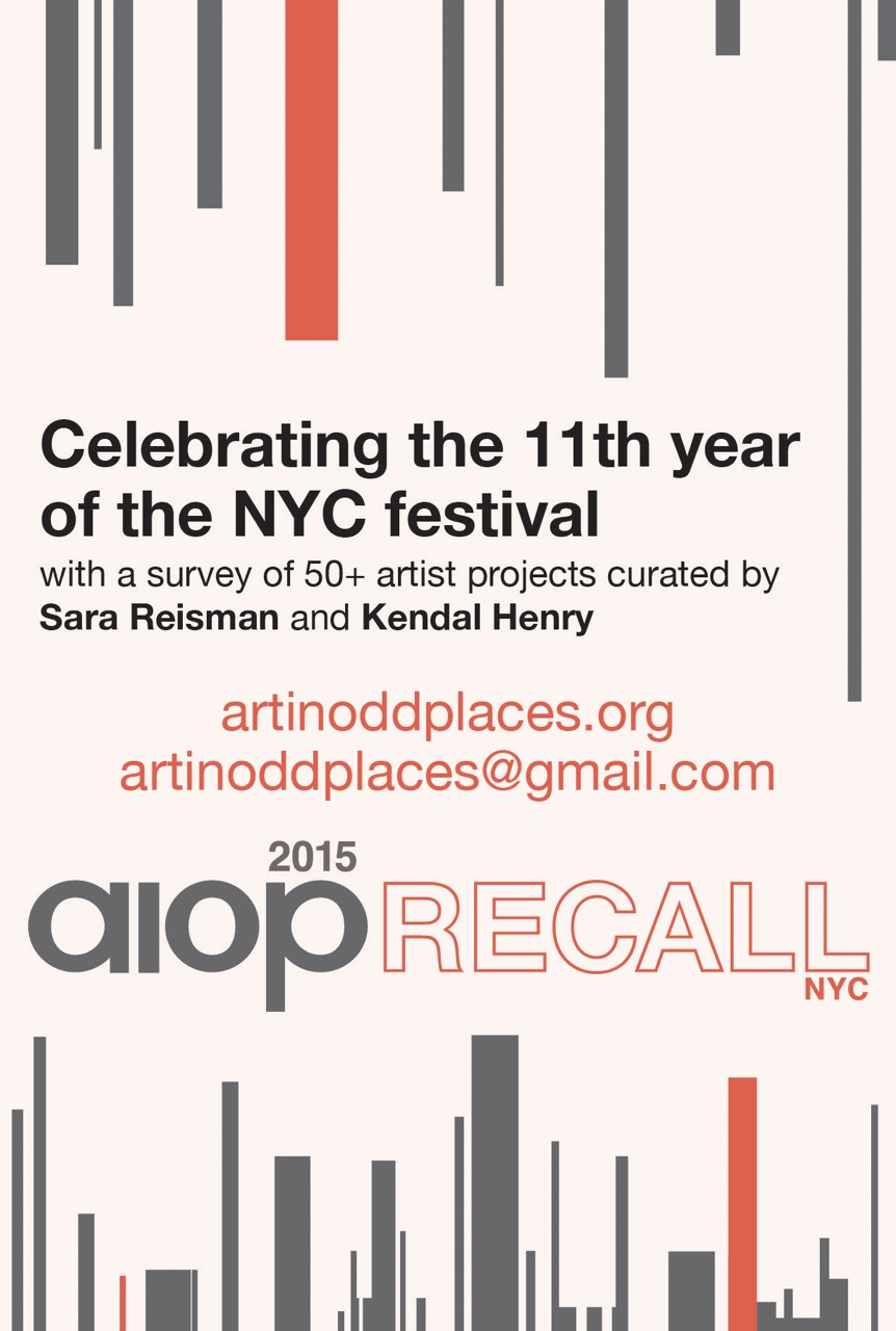
2015 Recall
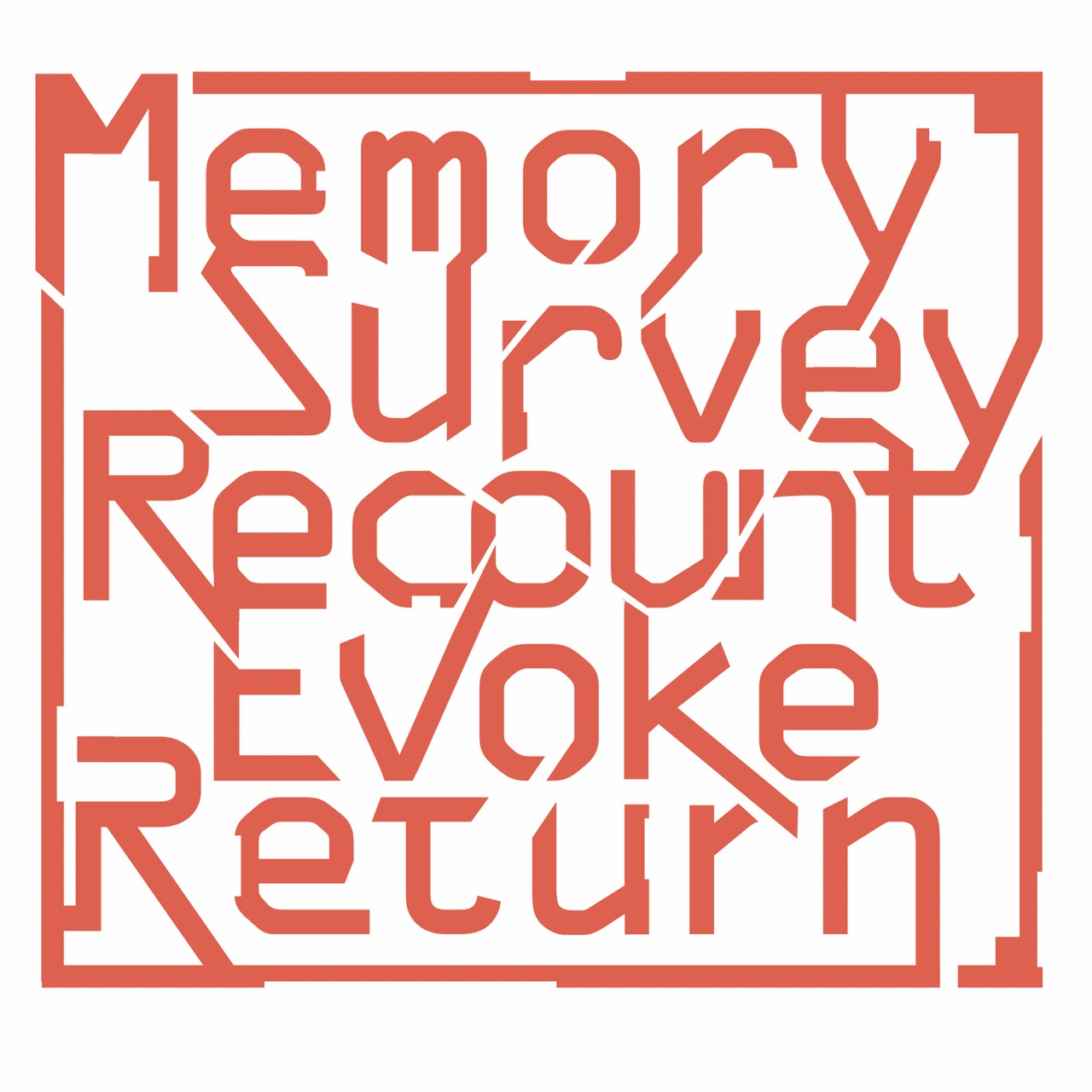
I wanted to build on the same FREE theme, but make it look functional but feel like a broken directory system. Thats where the hover microanimation idea derived and the folder tab layout. Recall was an indicator I should dial it back a back. Keeping up with the content and functionality across multiple years was becoming difficult as a single designer and developer. I feel you can see those crack in this design and build.
2016 Race

I started this theme from scratch, with a concerted effort to simplify. I wanted to keep it light, simple, and open, with less compartments like previous years.
2017 Sense

Sense is another of my favorite designs. I really wanted to push for a bit more experiential treatment to the site, as an artifact of the yearly exhibition itself, but not compete or diminish the artists work. Thats where the slow fades and random overlay multiply burns took shape.
2019 Invisible
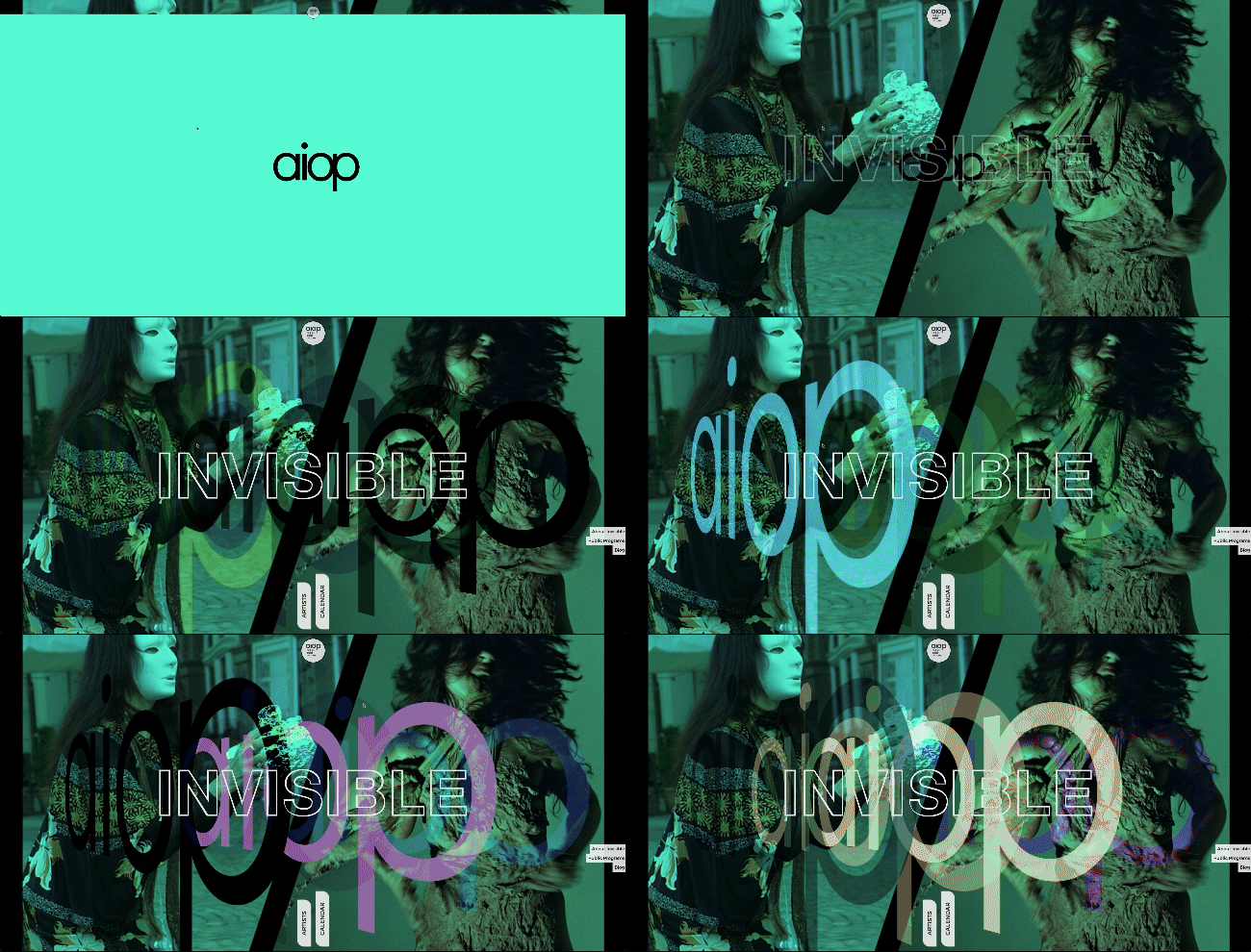
Ed asked me to come back for the 2019 festival exhibition. I wanted to do something a bit crazy for this year. I had become very proficient in Javascript and backend services, so I decided to flip the site on two levels.
First, I wanted to backend to be driven by Google Sheets. The curators already used them to put the show together, so to improve the experience of the site content creator, I wired up the content in the spreadsheet to the application.
Second, I wanted to expound just how random I could get with the opening page, blending typography, with levels of visibility. That is why you see multiple logos overlaid with random set css blend modes, over a random set of artist imagery. Its a SPA-like build, so I wanted page transitions as well. This is my favorite design I made for AIOP, and I still enjoy just sitting and reloading the home page over and over to see what permutations get created.
Print & Other Media
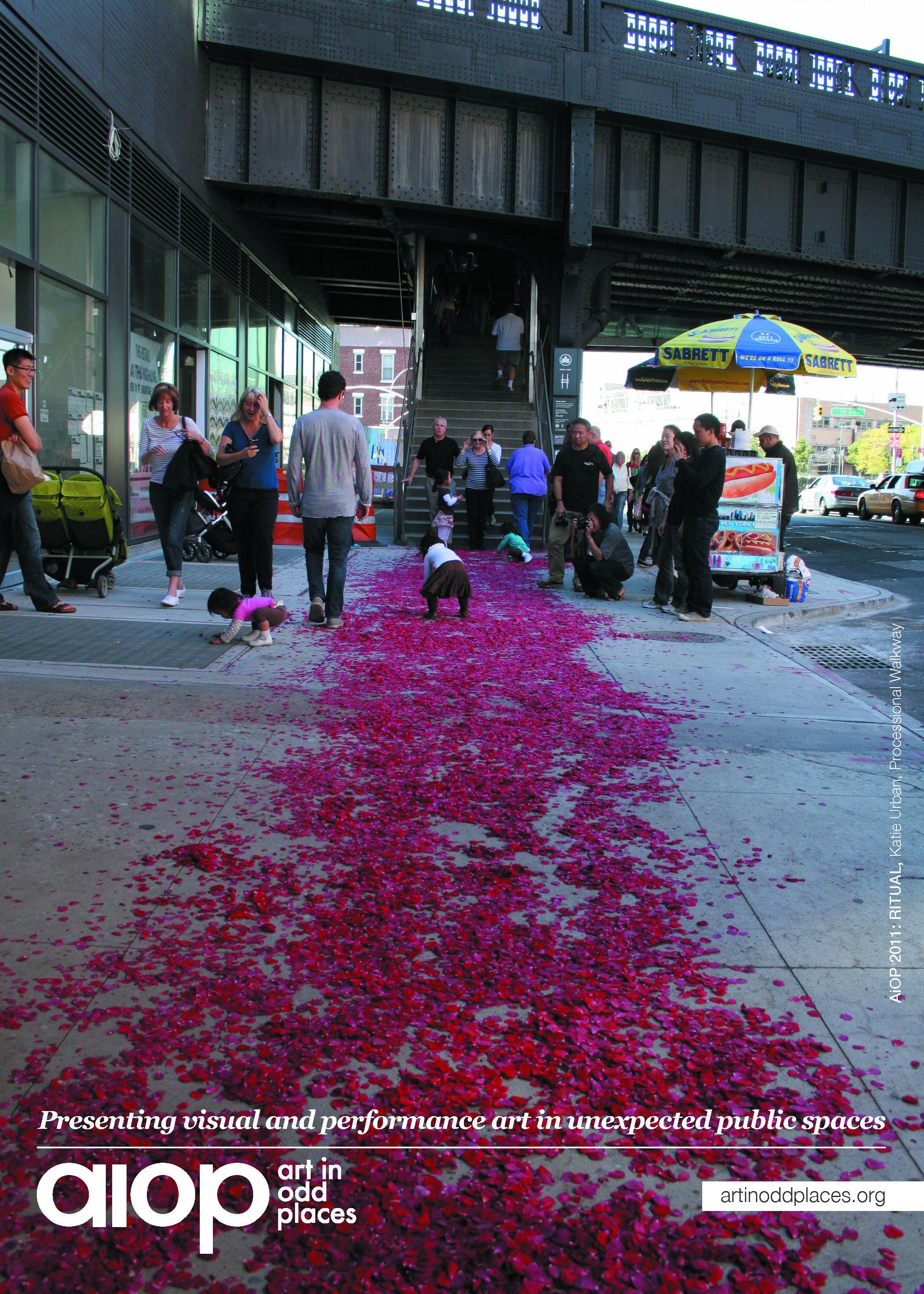
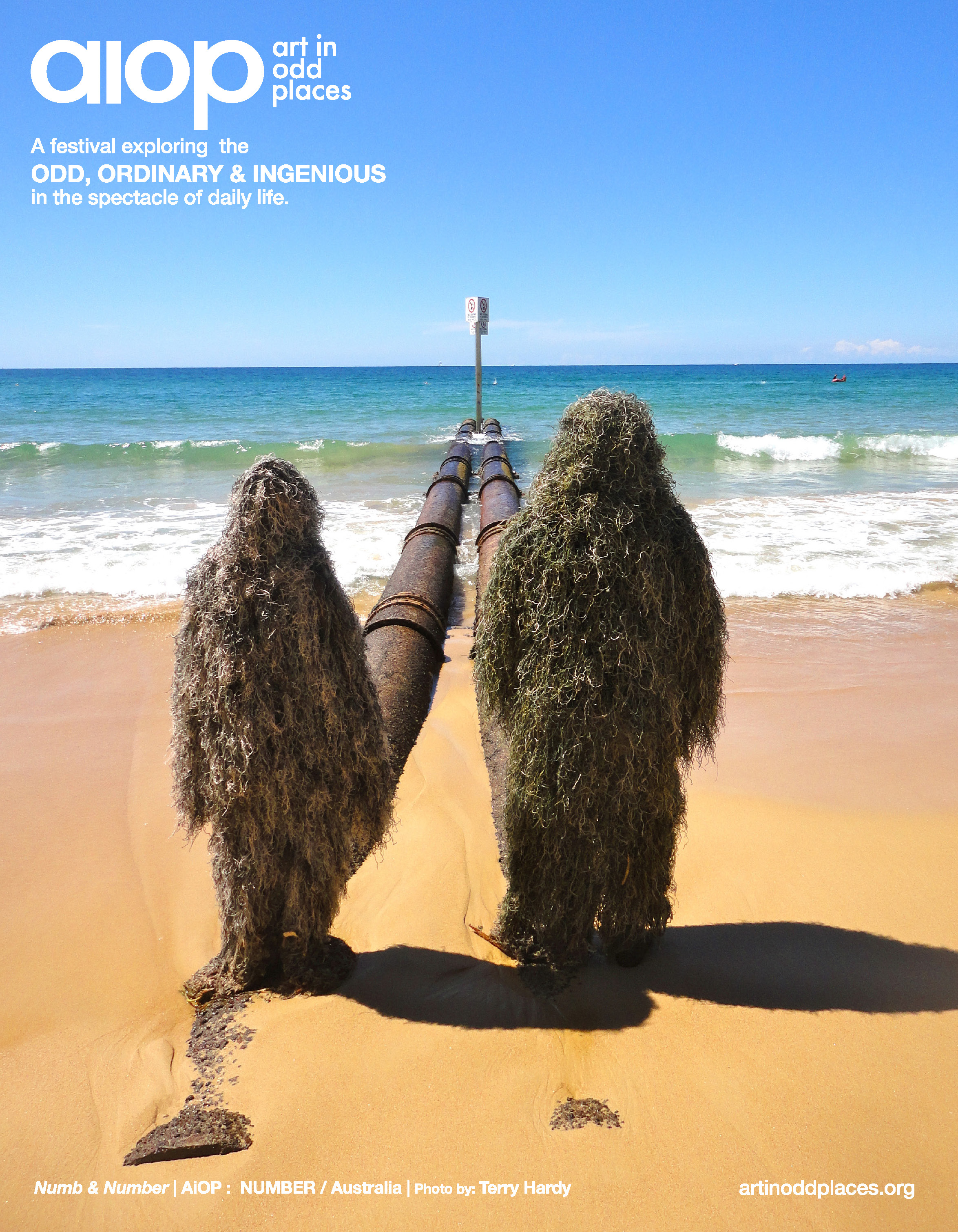
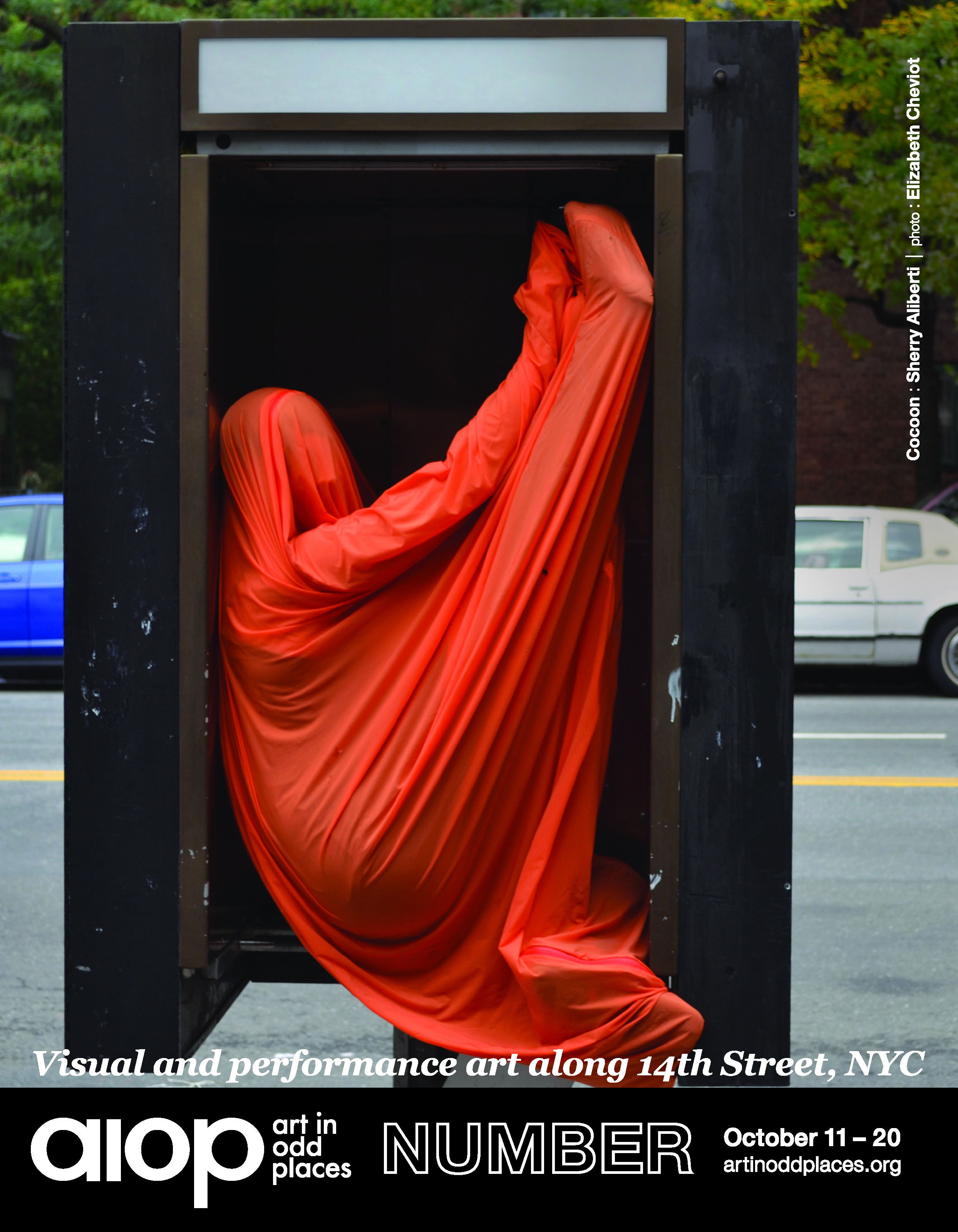
I also created a lot of other collaterals for AIOP throughout the years. Here are a few examples:
I shot a promotional video.
Video Description: I series of quick shots across 14th street in NYC, with the text AIOP: Free displayed on the screen.
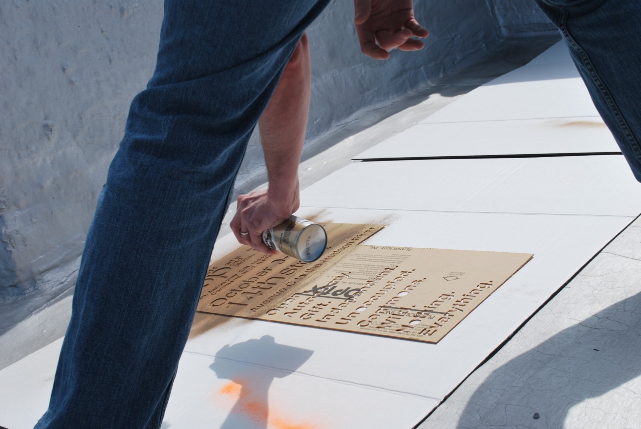
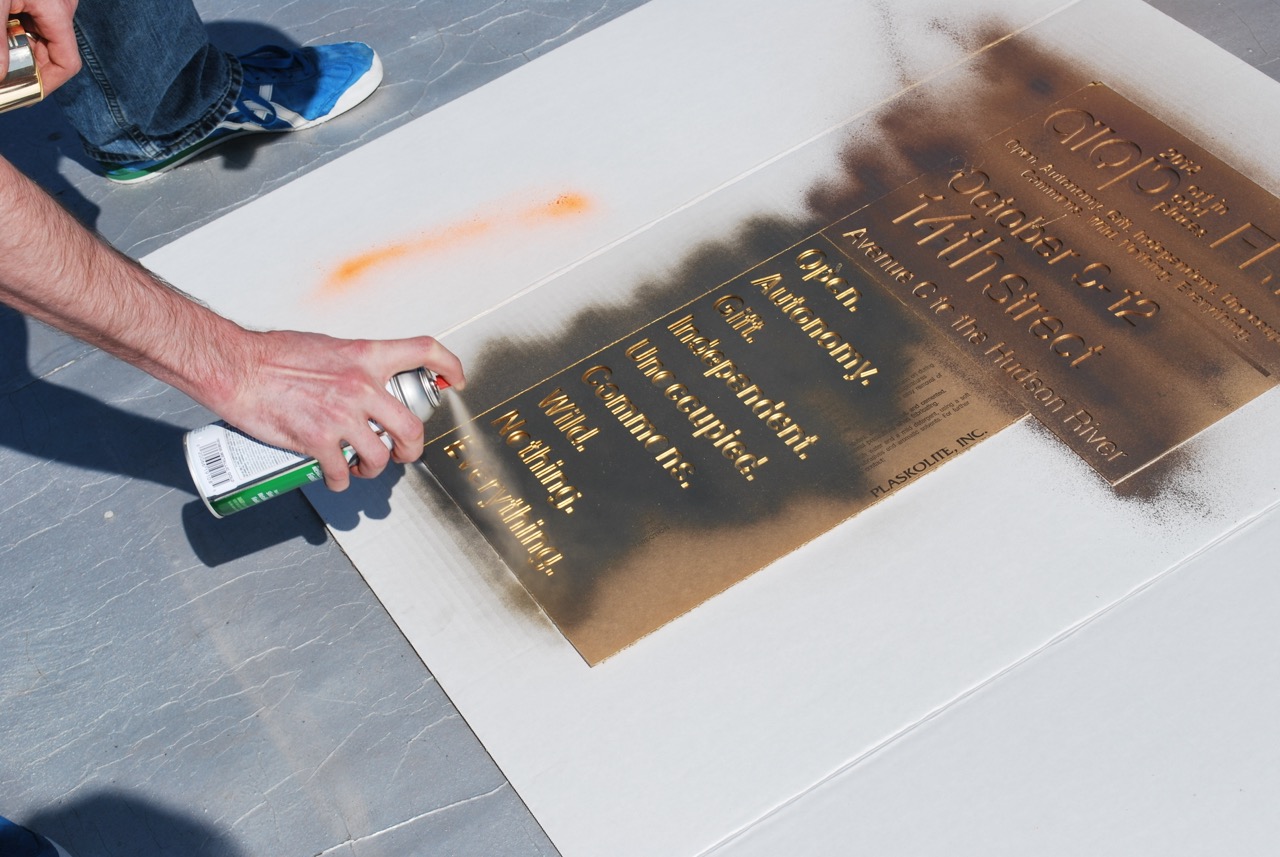
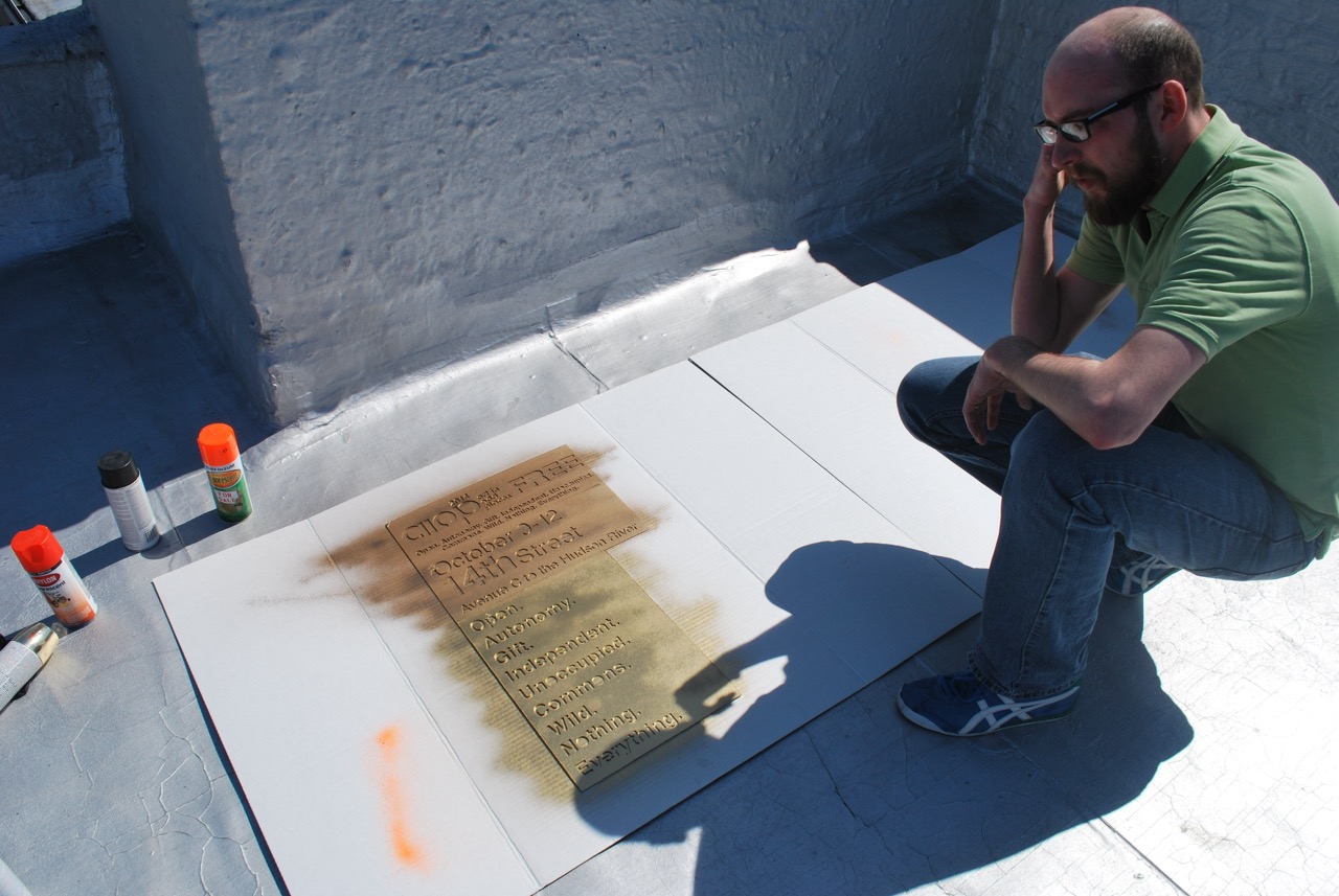
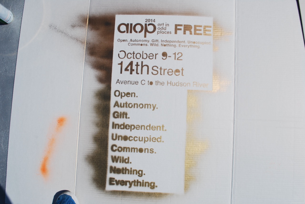
I created a laser cut board and hit the streets doing a little graffiti as well.
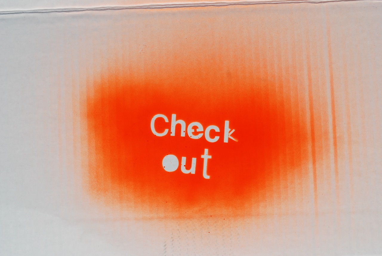
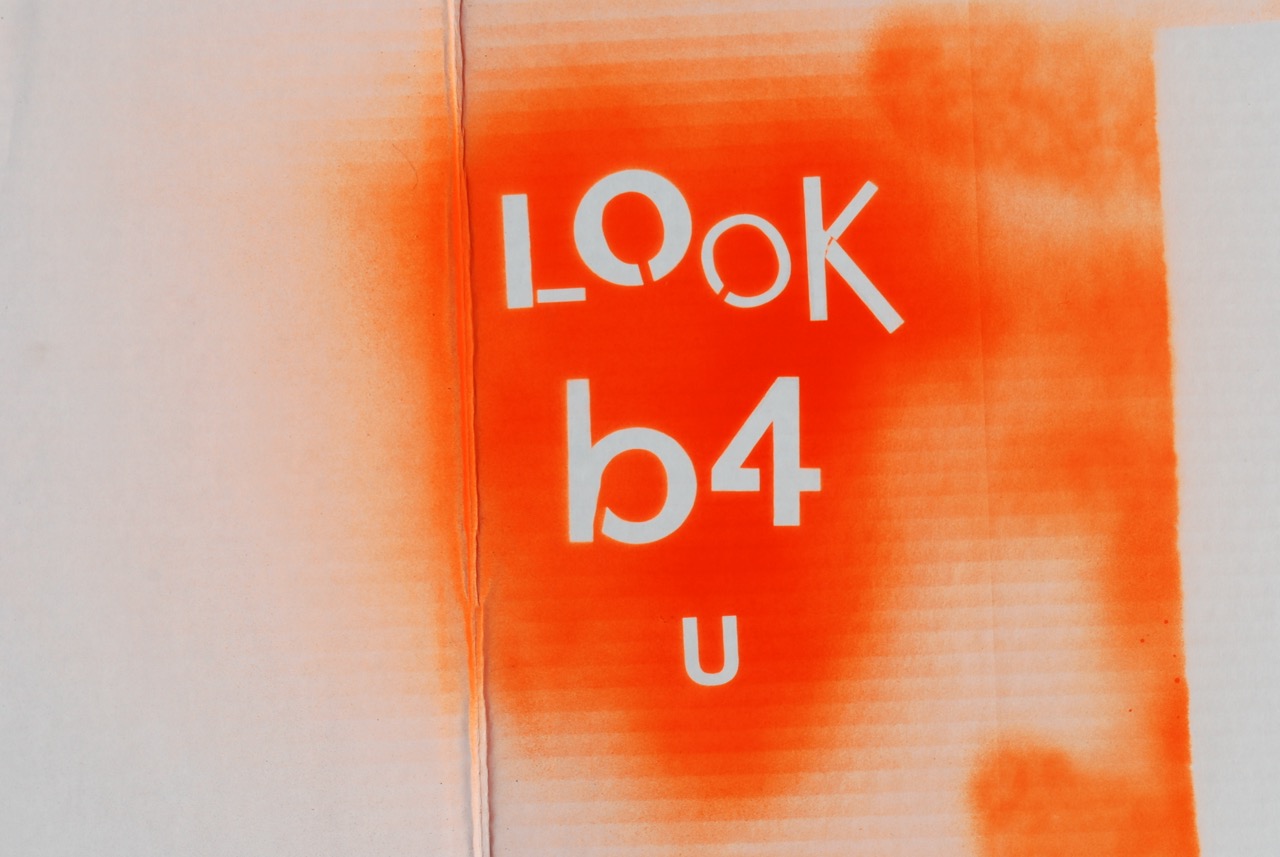
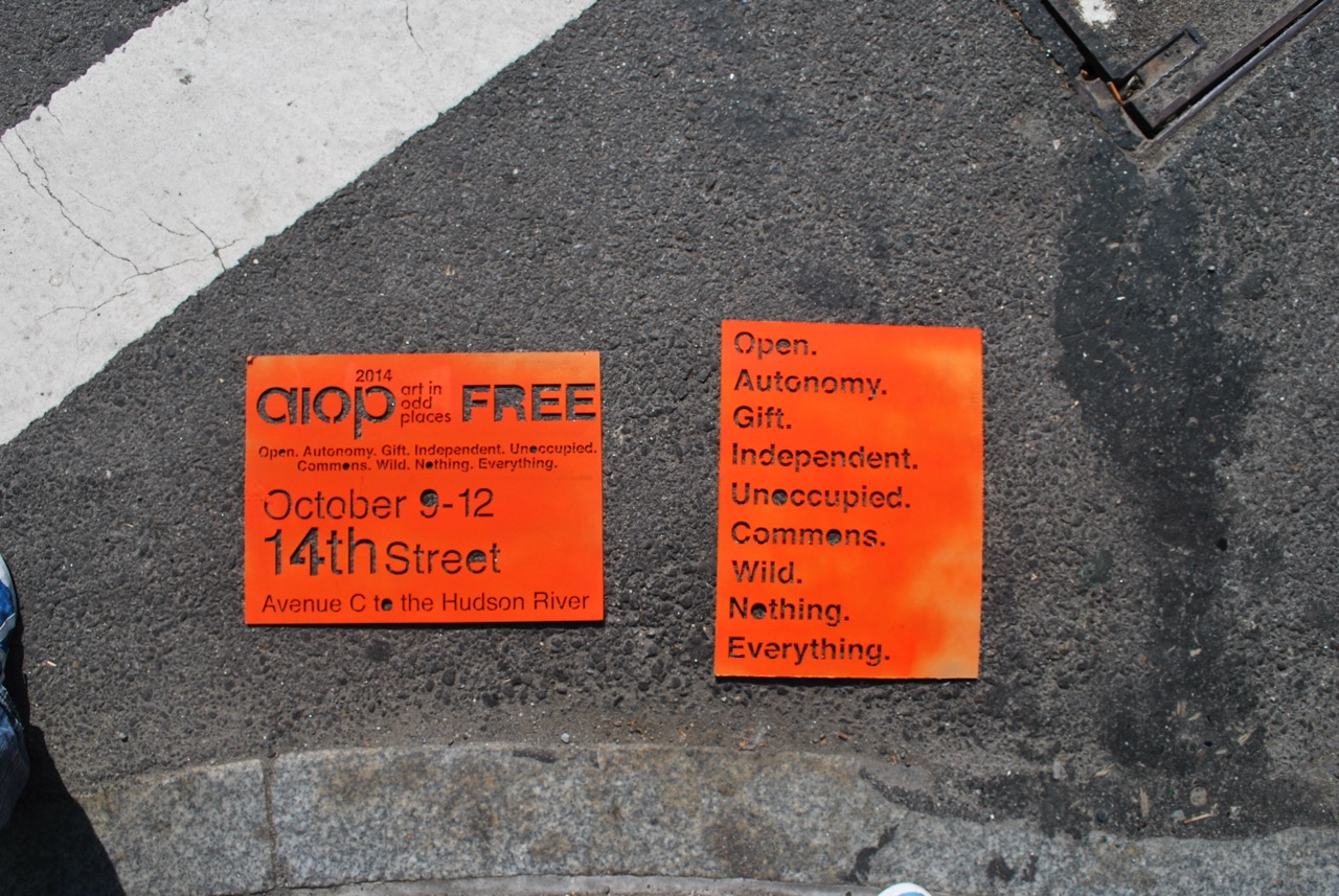
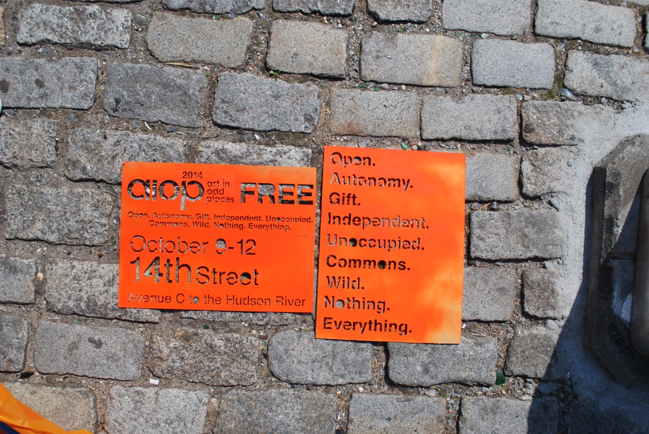
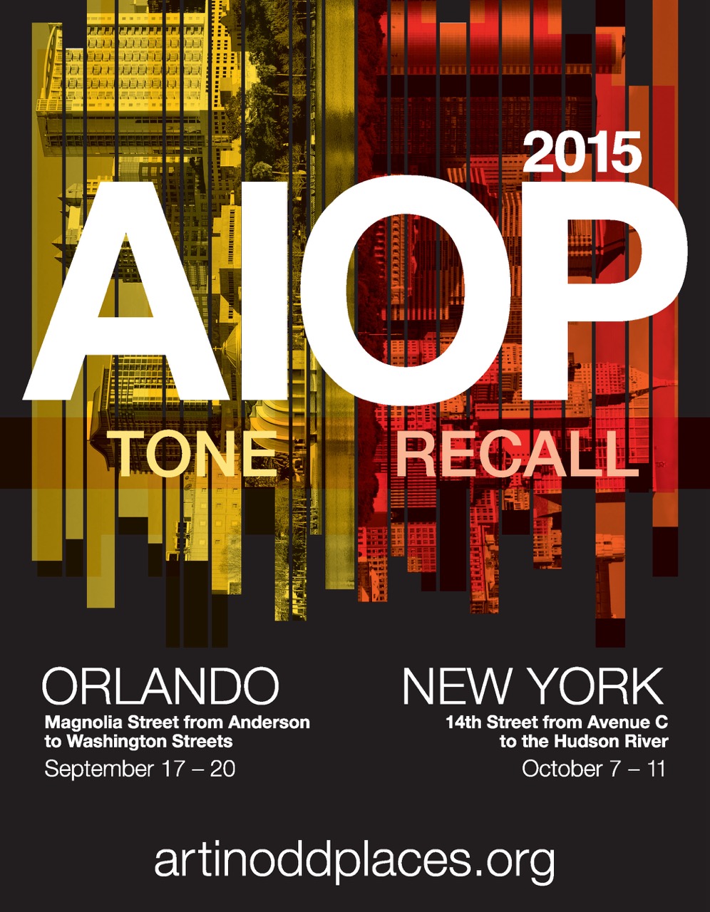
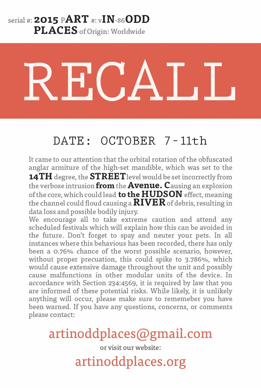
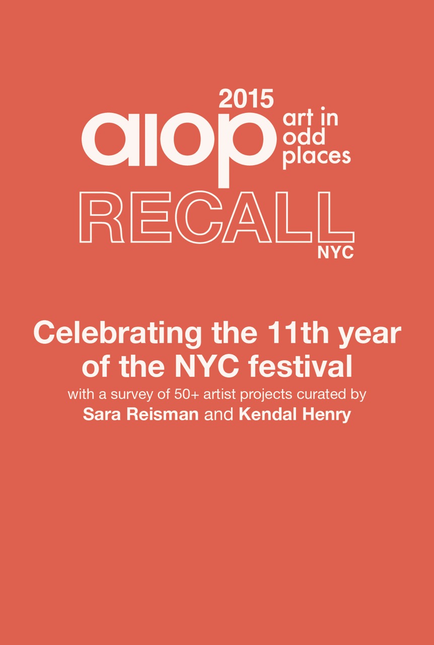
For 2015 : Recall, we made handout cards to distribute across the city.
Art in Odd Places reminds us that art isn't confined to galleries and museums—it lives on the streets and in the unexpected corners of our everyday world, inviting us to re-imagine the familiar as fantastic.END