Intelligence for Good

This incredible company is working to keep people safe from on-line scams. When Intelligence for Good approached me to develop their visual identity and web presence, the challenge was clear: Create an authoritative, trustworthy digital space that empowers victims of cybercrime and underscores the global significance of digital security.
Brand Identity: The Creation of the Logo
The journey to find the definitive logo mark and typography started with some conceptual brainstorming, just to get the visual parameters of what I knew I wanted in the brand aesthetic. My first concern was, damn that is a long name! I assumed typography would be tricky. I was confident I would need a logo mark, just to supplant the wordmark sometimes.
I knew I wanted something that felt techy, something dipped in digital, since after all, we are working in a crypto, online space. I also wanted something that felt personal and caring, Something that felt like it was coming from a place of altruism and not this mean, watchdog type feel that you often see with personal security brands.
So I began sketching out some of my initial ideas which had connotations of smiles, brains, dots, swords, shields, circles, robotic looking structures, speech bubbles, hearts wrapped in brains, hearts made up of o's, etc. Shaking the tree, as they say.
Of the 100 or so initial sketches, I moved them into vector format and started iterating. I also brought in some typography treatments to see how I would grapple with the long name. I wanted to experiment with angular typographical shapes, but also some more quirky options to see how it all locked together.

After a few trips back to the drawing board, I stuck to the bold angular shapes, which is what lead me to the angle heart shape. I added the connective points on the end to set the altruism concept within the digital world concept. I was drawn to the Chalet typeface, which felt modern and approachable. The nice geometric round "o" forms paired with the soft heart corners and corner dots.
And thus, the Intelligence for Good brand began!
You can read more about the brand concept here.
The next step was to begin formalizing the lockups and documentation.
(WIP) Brand guidelines.
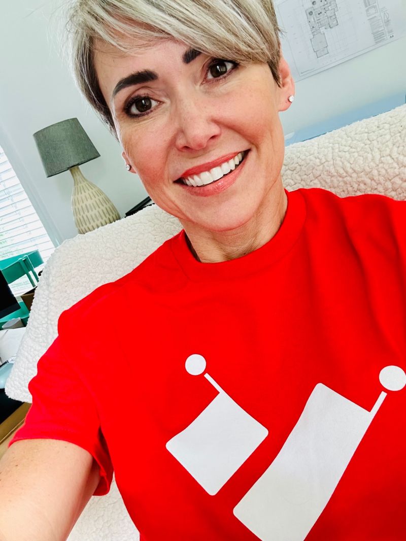
We even had shirts made.

Follow the great things I4G is doing on LinkedIn.
Website Design & Development

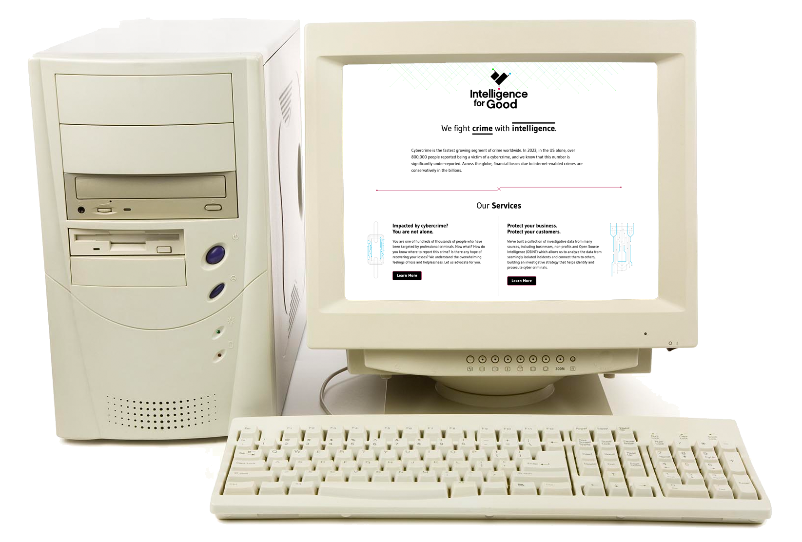
We had a short runway to launch the intelligenceforgood.com, so I had to balance design and build complexity with the deadline of three weeks. With that in mind, I wanted the website, which at launch is a simple HACS (Home / About / Contact / Services), to have a lots of negative white space, but supporting graphics and iconography to appear complex. I echoed the brand concept of data points and their connectivity within that iconography.
This site is still evolving with more animations and updated features as we continue to grow. My goal is to get this into a sophisticated code framework, backed by a CMS soon, as we start pushing more collaterals and creating more user stories.
Did I mention I am doing all the development and animation work as well? I am, what the industry calls, a unicorn.
Marketing Collaterals
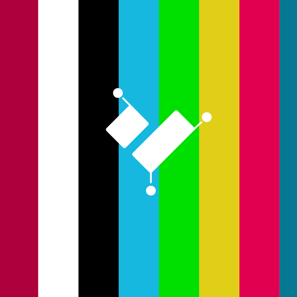
We are still designing and developing collaterals for IFG, so this section should grow in time. So far, I have created some banners for the LinkedIn site, which demonstrate the legs and viability of the brand, this far.


Watching the Intelligence for Good brand and website come to life was a rewarding experience. The challenge was not just to create visually pleasing designs but to develop a platform and identity that could genuinely assist and empower. Through collaboration, dedication, and a clear focus on the end user, we built a brand that stands tall in the fight against cybercrime.
Do what you can, with what you have, where you are.END
