Careful with that Axe, Eugene!
What is the Axe DevTools plugin?
The Axe DevTools plugin is a powerful tool designed to enhance web accessibility by enabling developers, designers, and testers to easily identify and fix accessibility issues directly within their workflow. Developed by Deque Systems, this plugin integrates seamlessly with web browsers, offering comprehensive accessibility checks against the Web Content Accessibility Guidelines (WCAG), Section 508, EN 301 549, and others.
To preface, I use this extension everyday and absolutely love it, but I am reminded daily of pain points that could be resolved with a few UX improvements and additional integrations. I started by mapping out the existing workflows.
🙂 The Good
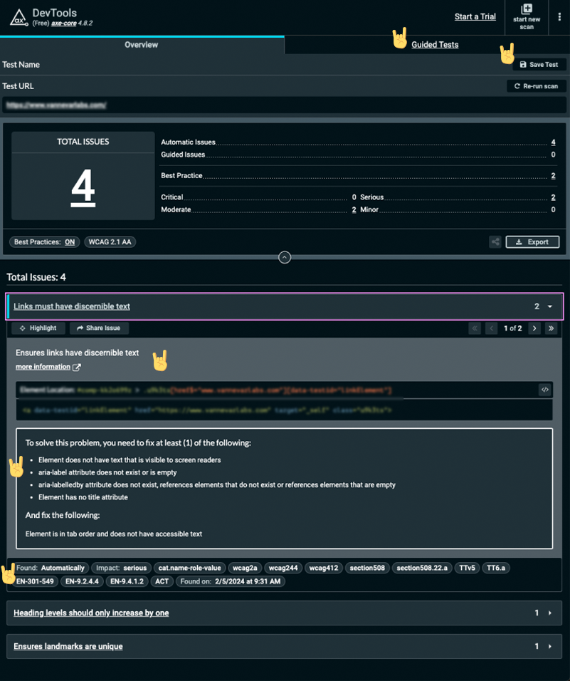
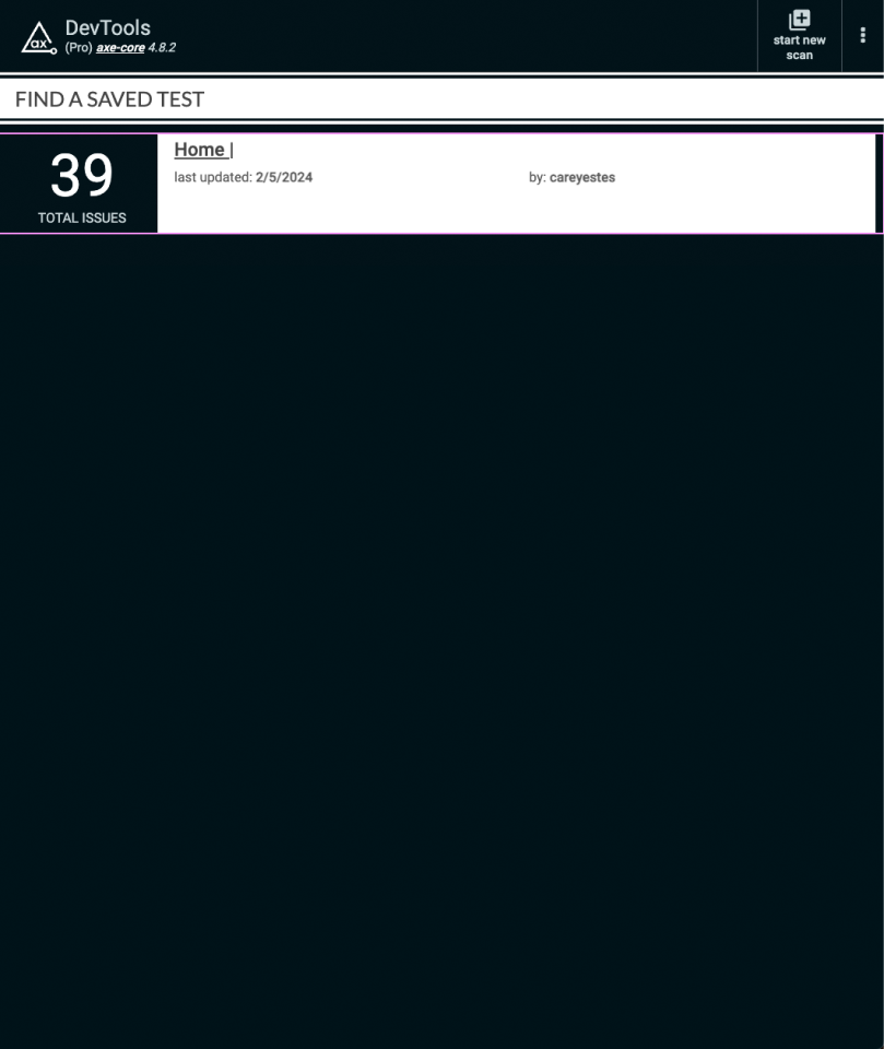
The entry point for the user is easy and straightforward, and the overall UX is an improvement compared to other accessibility testing tools. There are also useful features for focused testing, saving and sharing audits, and links to documentation.
😕 The Bad
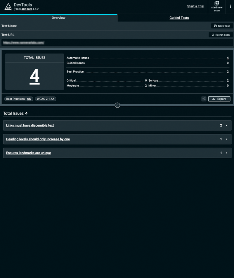
However, there are significant drawbacks regarding the UI design, visual hierarchy, copywriting, and easy user paths to solutions.
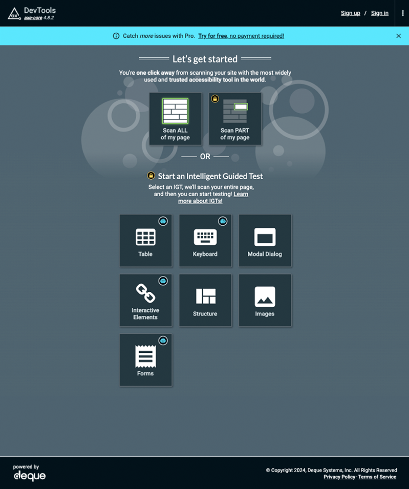
- Weak visual hierarchy: The color theory and visual language does not help prioritize the important elements in the report, along with an overabundance of visual clutter. The predominantly monochromatic palette and heavy use of number values to represent data blends the page information together. The interactive elements on the page are laid out sporadically and not in proximity to related functionality or data points.
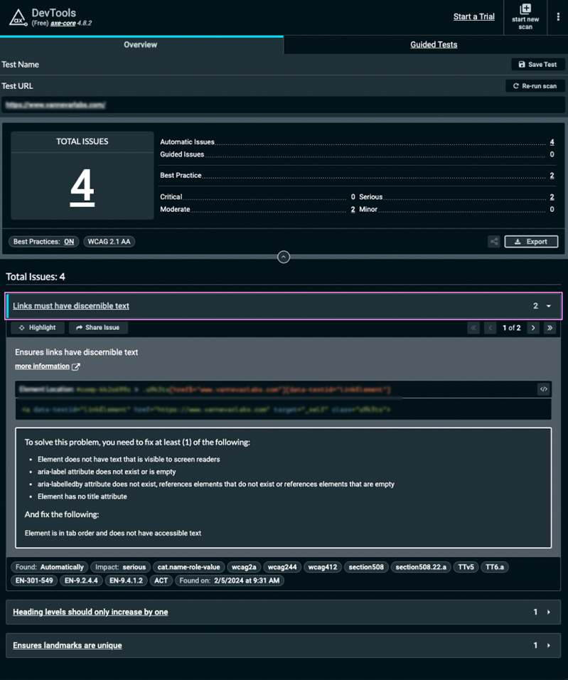
- Poorly constructed solutions: The tool targets and isolates the offending line or lines of code, but falls short of providing good solutions. The solutions are often obtuse and not written as code, but pulled from nebulous documentation, making simple solutions often sound overly complicated. The tool relies on the user to have extensive accessibility knowledge to make good decisions on how to resolve the issue.
- Off-site Documentation: The description of the issue in the tool is often confusing. Axe attempts to solve this by linking to Axe documentation, which takes the user out of the tool by opening a new tab, which disrupts the workflow. The user never fully grasps the real impact of the issue, which makes implementing the solution feel more like tedium, rather than a true experience improvement.
- Lack of real user support: Accurate accessibility testing and review requires real users to confirm the accessibility feature is behaving as expected. Automated scanning can only check a fraction of the overall user experience. The tool, in its current state, does not give the user confidence the issue is truly resolved, because solutions are based on automated scanning and not proper manual user testing.
🥳 The Solution
This brief proposes UX enhancements that address the aforementioned deficiencies, which will elevate the tool far beyond its current capabilities and empower its users to learn and improve their products.

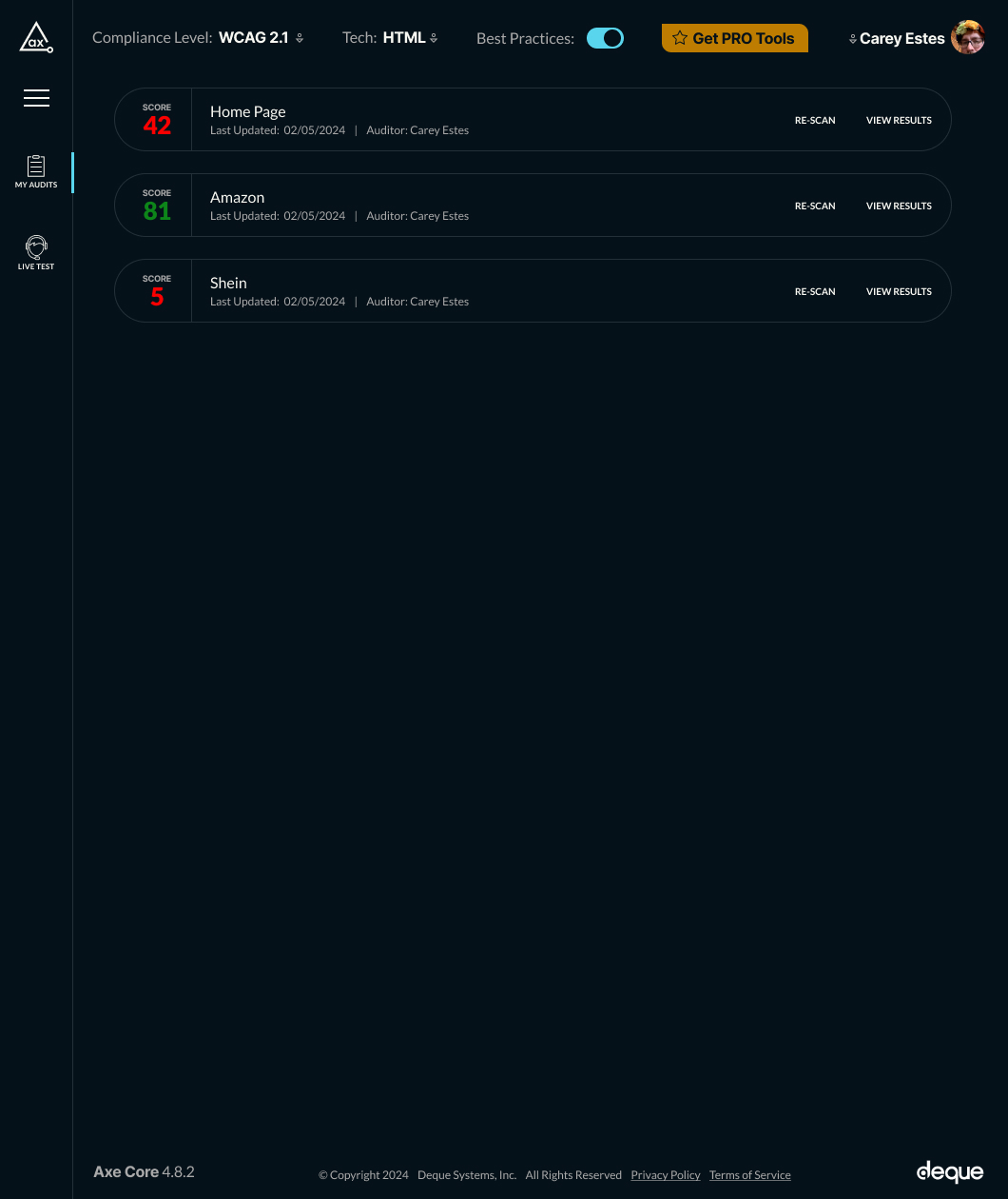
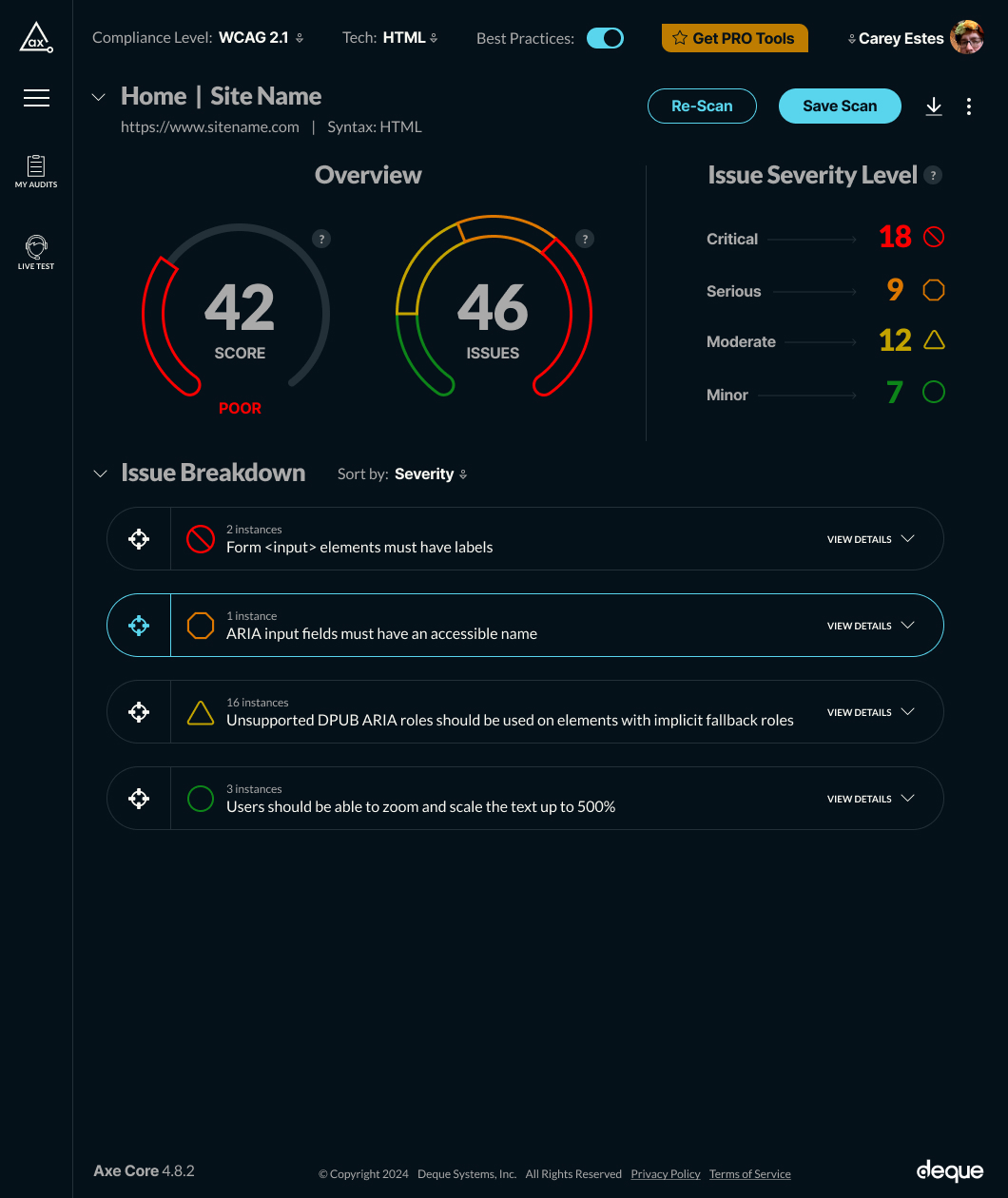
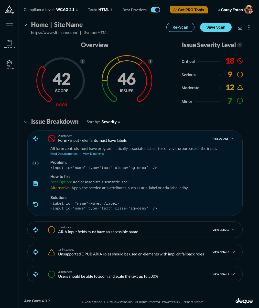
🤩 UX & Feature Enhancements
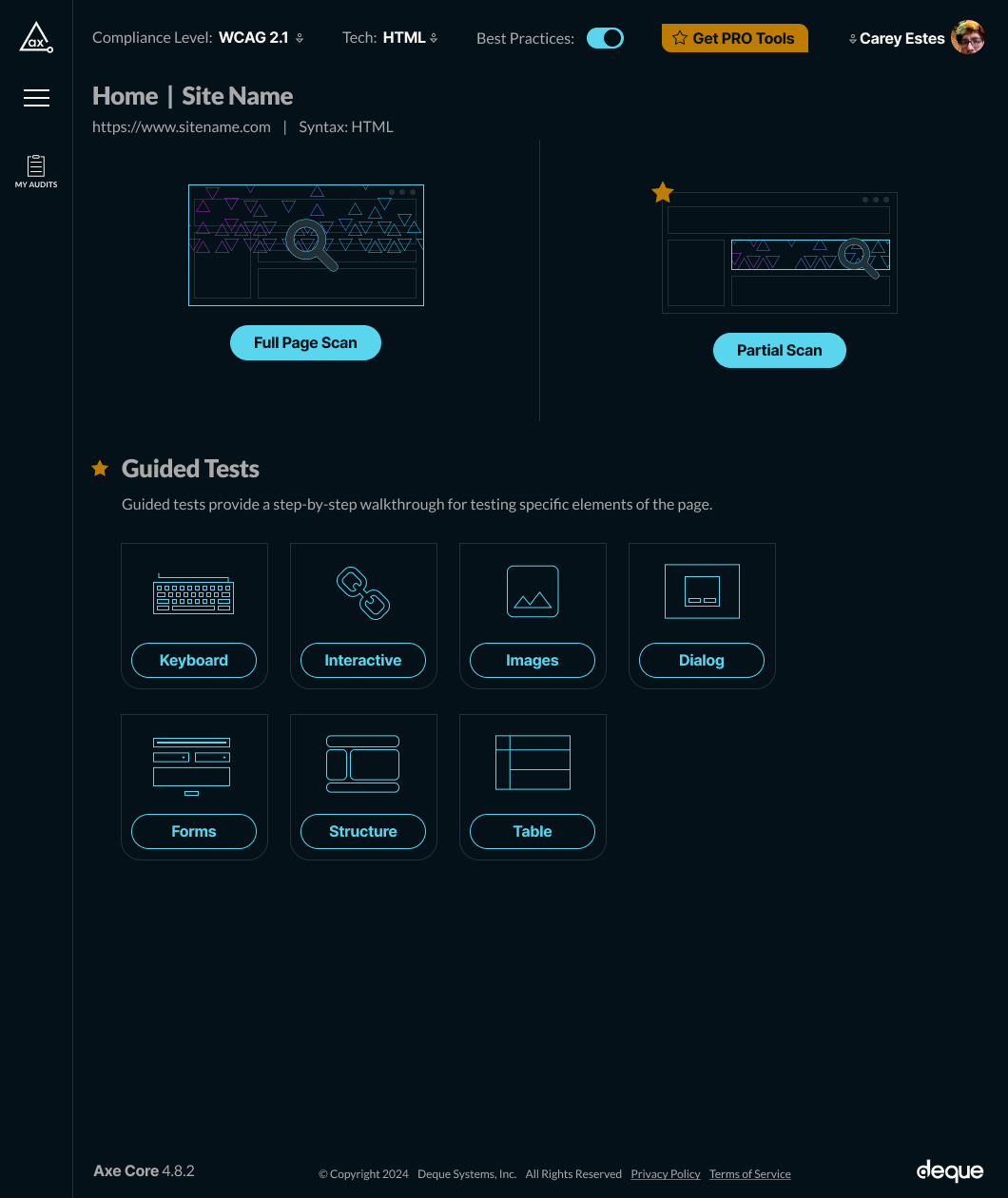
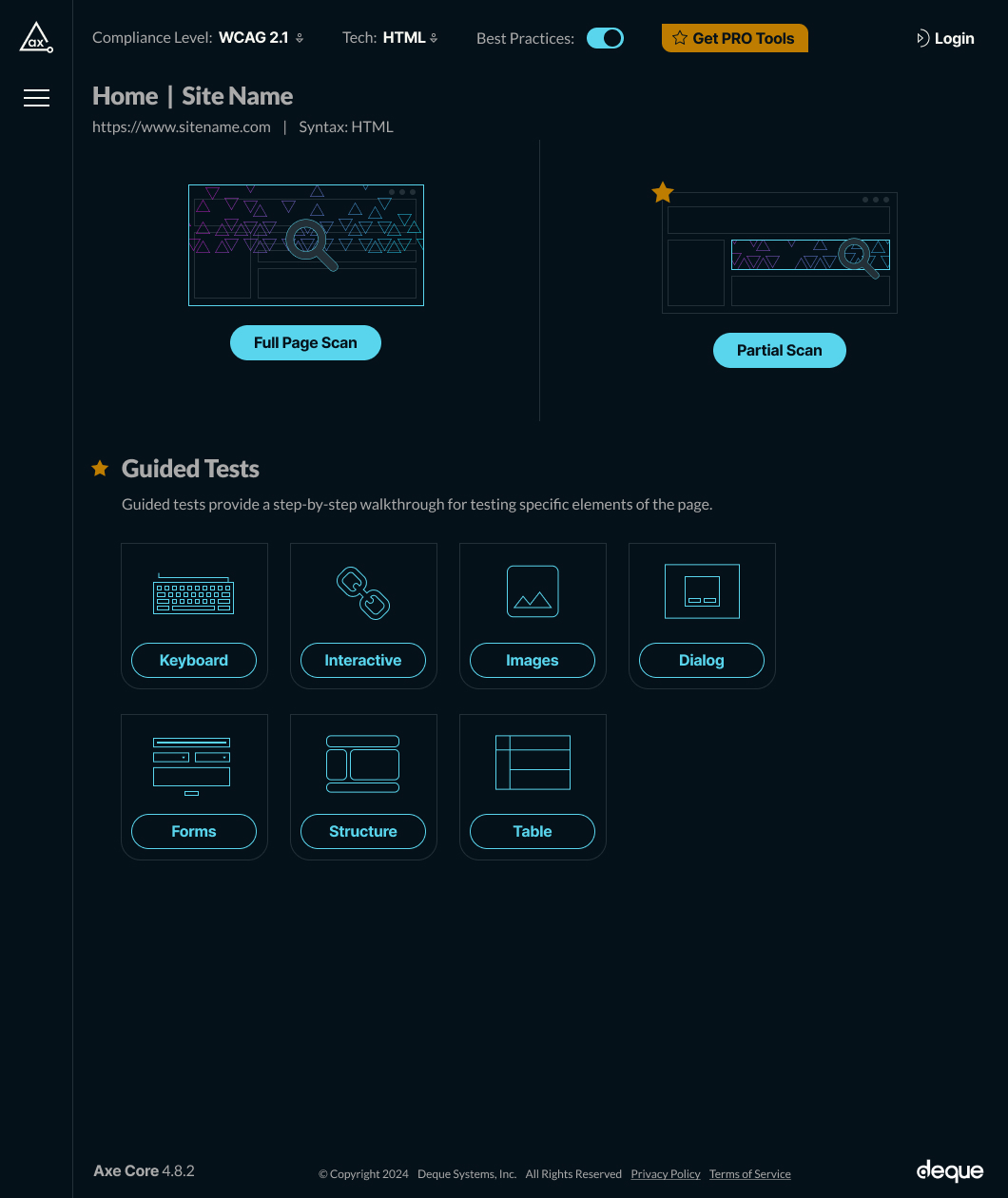
- Improve the UI The new UI establishes a well-defined, energetic color palette with improved, consistent, intuitive visual patterns. It incorporates visual diagrams and font scales to punch up the important data points. The functional mechanics and information are restructured logically on the page making the tool more intuitive and clear.
- Deliver easier solutions through a Large Language Model (LLM) This new feature integrates an accessibility-focused language model into the solution section. The issue description, DOM code, and all contextual information is sent to the model and a response is generated, giving the user a detailed, specific solution to apply to their code. A feedback system will be integrated to improve the learning model, to provide consistently better answers through continued use. If the technology stack is recognized locally, the component file will be identified and the solution will be applied directly to the file in the designated IDE.
- Add supplemental educational material in the tool We will produce high-quality video reproductions of each issue, just as the end-user would encounter it in the application, and link to those videos inside the tool. This will help educate the user and reinforce the importance of resolving these issues. We will also improve the copy descriptions of issues, emphasizing the altruistic purpose of making the improvement.
- Integrate live testing A major deficit in accessibility testing is easy access to reliable human testers to confirm accessibility issues are resolved and no regressions were introduced. This ground-breaking feature will connect to a live tester directly, allowing them to view, share, and control screens to properly test and provide feedback directly to the user. The user can choose from a pre-set of technology and disability scenarios, so the tool connects to the appropriate tester, and a feedback system will be put in place to help rank and vet testers.
The power of the Web is in its universality. Access by everyone regardless of disability is an essential aspect. – Tim Berners-LeeEND