The Babel Street Come-Up
I was brought onto the Babel Street team early in the start-up phase (Employee #18!). When I got on the scene, there was little in regard to a Design System, a Component Library, Accessibility Attributes, a Front-End compiler, or a Developer Experience.
I immediately began to fix "ALL THE THINGS!"

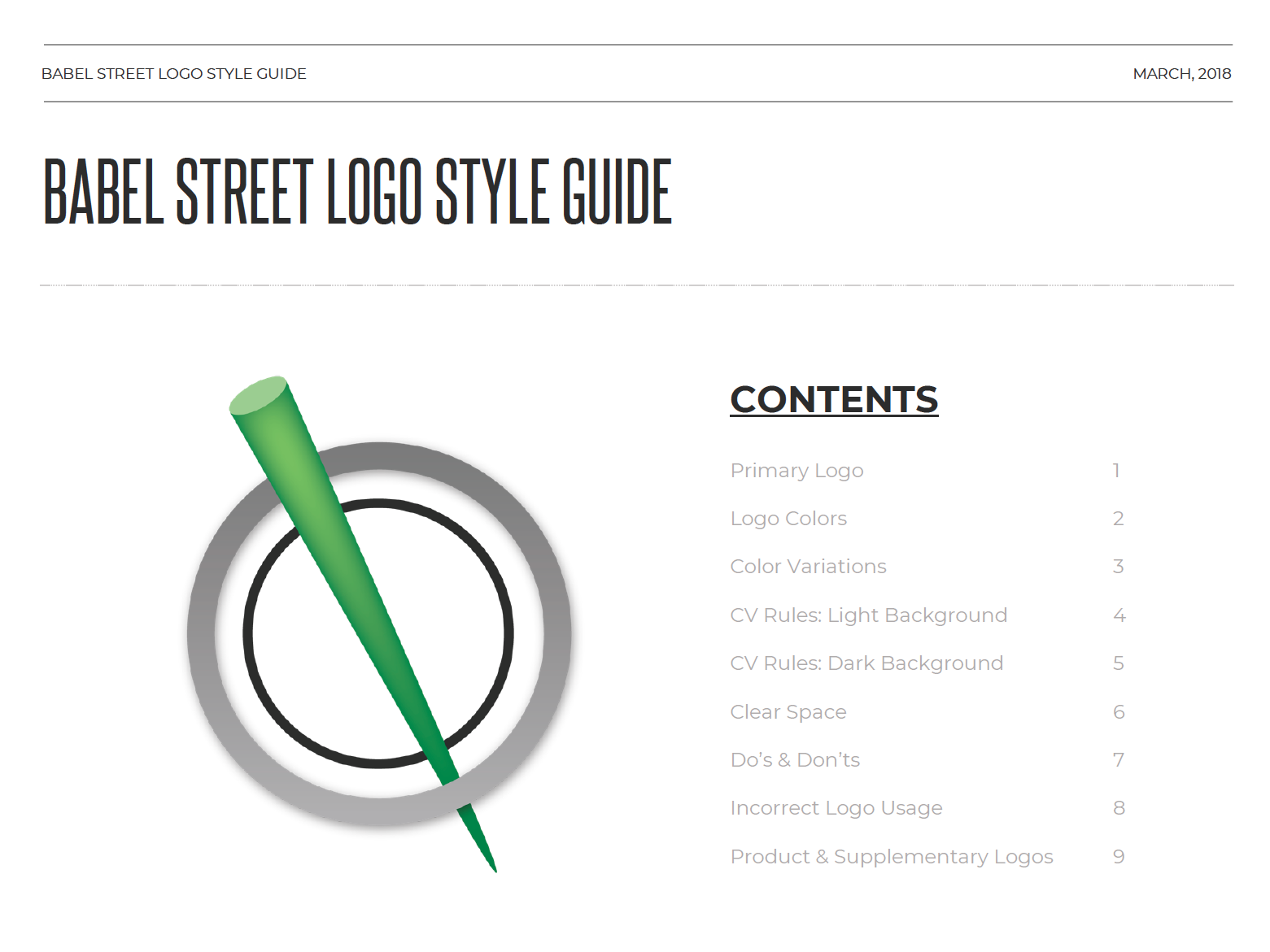
The Initial Branding Guidelines
It was important to set some early goals in order to get a baseline on the direction we would head from a design perspective.
With that in mind, the first thing I did was create a Style Guide. This helped establish some needed parameters regarding spacing, color, and typography. After putting the initial draft together, I knew we would need to work the messaging and visuals from a branding perspective, but this gave me the latitude to start working on a plan for the application itself.
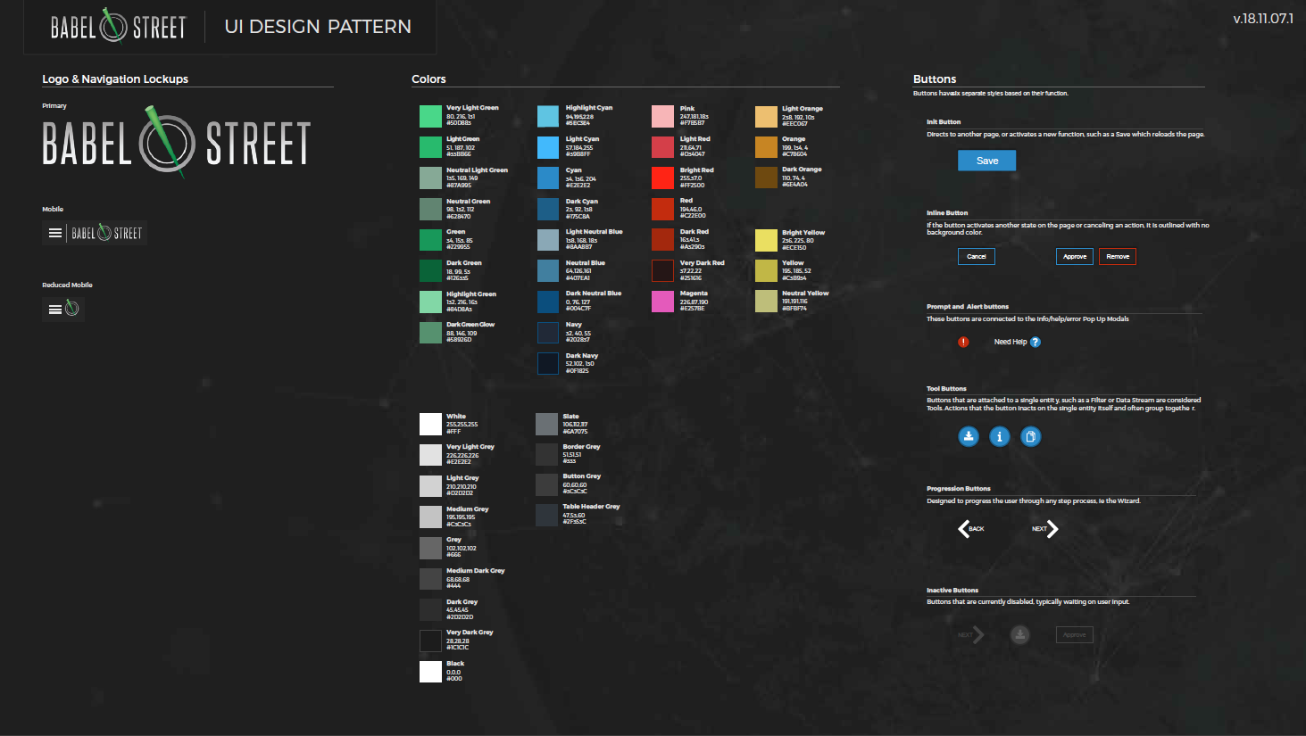
The Component Library
With established typography and color documented, I began working on the UX Design Patterns for components. The objective is to break the individual elements down into atomic parts and bring them back together in a cohesive system.
Accessibility & User Testing
Babel Street is required by law to adhere to 508 compliance. With that in mind, I have worked to incorporate WCAG compliance levels where possible. The benchmark is single A, but the goal is always the AA level.
I have incorporated an iterative loop for user testing. It's a system that provides feedback to the product team, which gets rolled into sprint planning and grooming, resulting in action items for the development team, which gets pushed back out to a production or beta environment, then back to the user for further feedback. The echo chamber system has not only proven useful for making educated adjustments to new and existing features, but also established buy-in from stakeholders that the work being done has a positive benefit to revenue.
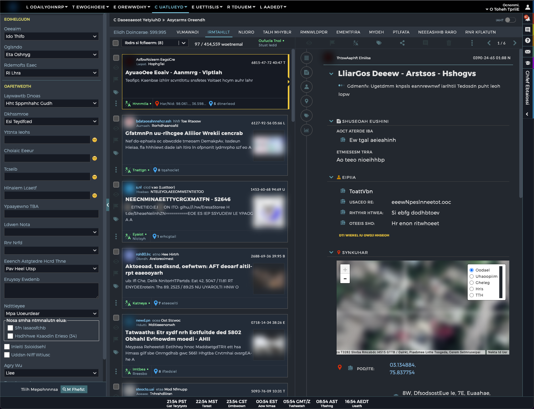
Here is an example test of a current Beta feature in a very prominent sector of the application:
Usability Tasks
The usability tasks have been derived from test scenarios developed from use cases.
The task descriptions below are required to be reviewed by the application owner, business-process owner, development owner, and/or deployment manager to ensure that the content, format, and presentation are representative of real use and substantially evaluate the total application. Their acceptance is to be documented prior to usability test.
Task 1: From dashboard
You are looking for a recent story about [TRENDING STORY]. How would you go about doing that?
[OBSERVE/PROMPT: Where would look for that? What made you decide to look there? What do they click on?]
Task 2:
Let’s say you are looking for more perspectives on [TRENDING STORY]. How would you go about doing that?
[OBSERVE/PROMPT: What did you expect to see here? What kind of results or information did you expect to find? Were these the results you were looking for? What would you click first?]
IF the user does not go to Collection Results in task 1 and 2, uses Task 2a.
Task 2a:
Let’s say some told you Collection Results would be the best tool to use for finding recent stories. Try looking for the story there.
[OBSERVE: What do they click on? What do they add?]
Let’s say you want to focus the results. Try adding additional search criteria to include search. Where would you add this?
Task 3:
Translating the document results makes you realize you only want to see documents in English? How would you go about making that happen?
[OBSERVE: What do they click on]
You decide to share your search with a colleague, how would you do this?
[POST TEST CIRCLE BACK] How did you know what results to click on first? What information were you hoping to see? How can the experience be improved?
You decide you want to refer back to this search in the future, how would you do this?
[POST TEST CIRCLE BACK] How did you know what results to click on first? What information were you hoping to see? How can the experience be improved?
=================================
The original design for parsing through documents was rather tedious, which the majority of work done off-screen or in an older legacy dropdown control.
The new contextual search binds an intuitive auto-suggestion feature, with the refinement selection pane, to give the user a quick view of their query and easily make adjustments.
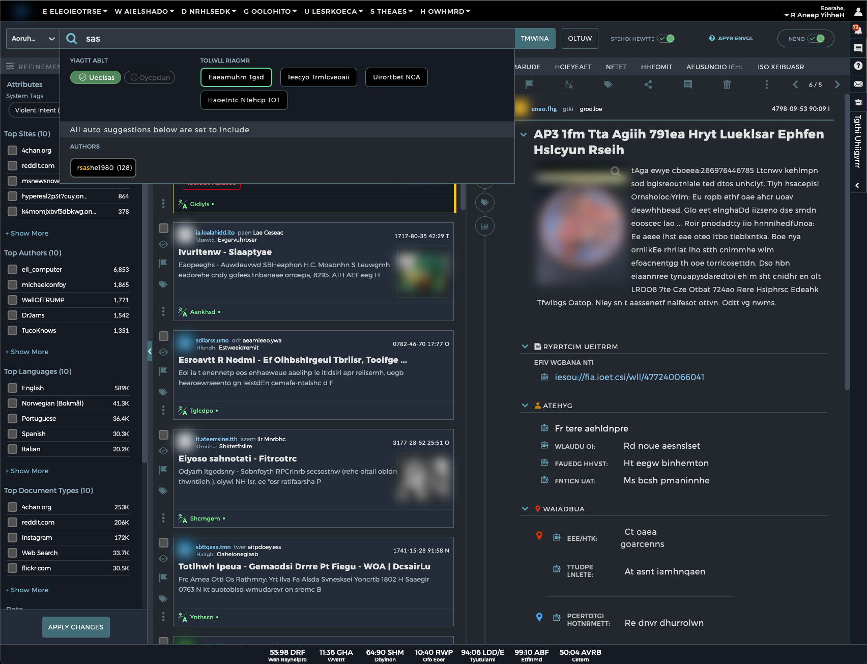
As the user stacks search criteria, it gets pushed to a pill, which can be deleted or changed, with the ultimate goal that the user can save the specific query to reference later.
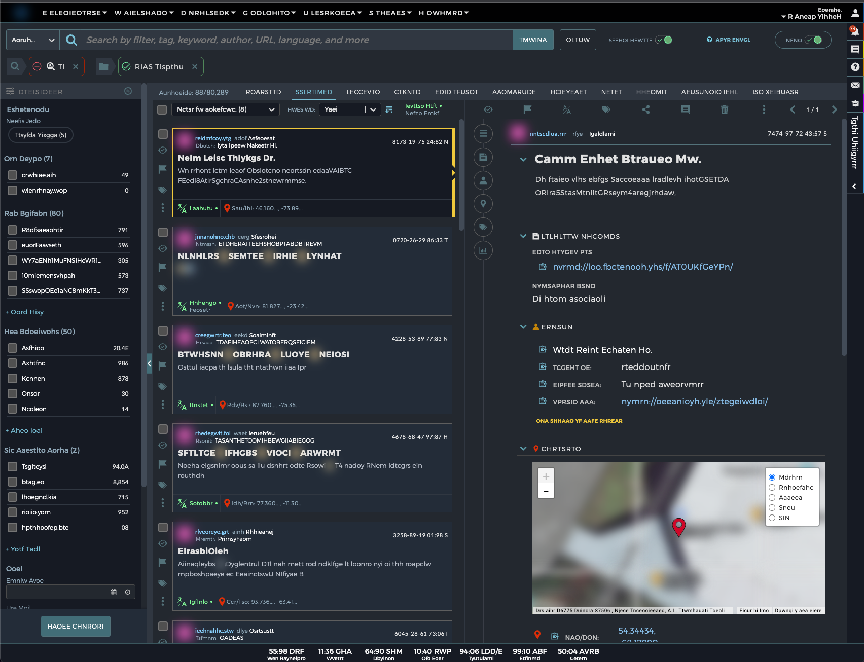
The refinement pane changes are now smarter checkbox refinement features, putting the most prominent, relative selections at the top.
This also leverages Storybook to bring in the mockups we make in Figma to make the design patterns more consistent and elevate the developer experience. This helps the accessibility effort, as we can attach the needed roles to elements at the atomic level, and also maintains parity across component design and interactions in the application.
Wisely and slow. They stumble that run fast.END