
University of Tennessee Redesign
UT brought me on the Communications team to help with the redesign of the main university site, as well as, integrate the satellite sites into a commonly themed design and brand.
The Communications team already had a very solid, well-defined style guide. The initial gist of the job was to update the site with a cleaner, more modern looking layout, that had the extensibility to be incorporated with the hundreds of subdomains in the University of Tennessee in Knoxville network.
Upon digging into the research side of things, such as a code review, documenting current component design patterns, and collecting user reviews and use cases, it became apparent there was a strong need to develop an accessibility strategy in the new design and development.
After establishing the larger, overall objective, I created the Accessibility and Inclusion Initiative, alongside Lilia Neville and Michael Purdy. The mission was to always design and build with the consideration of accessibility and inclusion being prioritized as high as other facets of web design and development. It would never be sidelined, or put on the list as something "to do later". We created a list of requirements, that must be met, before any new UT site hit a production server. https://thehill.utk.edu/accessibility/ https://brand.utk.edu/standards/colors/accessibility-color/
The list included:
- Create User Case Scenarios which include a diverse list of potential users.
- Meet WCAG 2.0 AA Compliance Metrics.
- User Testing is completed prior to deployment in a QA environment, post deployment in production, and ongoing, to assure guidelines are being met and the experience is effective to the user.
- Ever present research is being done to assure UT remains on the forefront of needed accessibility features.
While the guidelines and design have been ongoing since my departure in 2015, the main objectives and spirit of the Accessibility and Inclusion Initiative still remain.
Design Changes
User Testing
We live-tested a large pool of people prior to starting the design phase using the existing utk.edu site. This gave us a baseline to work from, to determine if future changes were considered improvements or impediments. We tried to get a nice matrix of users based on differing demographics.
We gathered multiple subjects (approx. 25) with the following criteria:
- Age ranging from 18 - 75.
- Gender, including but not limited to Male, Female, Non-Binary.
- Race, including, but not limited to, White, Black or African American, Asian, American Indian or Alaska Native, Native Hawaiian or Pacific Islander (We tried to consider ethnicity in this as well, but needed a more narrow result set).
- Experience level with technology.
- Typical workspace and/or desired viewport.
We also created a user test plan that would be completed by each user. An effective test plan should always have a predetermined, defined result, or at the very least, a desired conclusion. In our test plan, we had the user:
- Find the page to begin an undergraduate application.
- Determine where they could park on campus
- Learn what courses were offered by the College of Architecture and Design.
We were able to run tests on individuals with specific disabilities as well, such as blindness, corneal damage which caused narrowed vision, blurred vision, color blindness, tremors, cognitive disability, and dyslexia. Any outliers were added to the test, along with their demographics.
By leveraging real world, live testing of the individuals, we also got brilliant insight into the tools used to read and navigate websites, such as the numerous types of screen readers, their compatibility with browsers, and how each parse and relay a page differently.
For instance, JAWS is considered the best option for blind users due to the enormity of features it adds that other SR's do not offer. In a rather tragic sense of irony, at that time, JAWS worked best with Internet Explorer. That fact alone created a rather large design and development problem to solve.
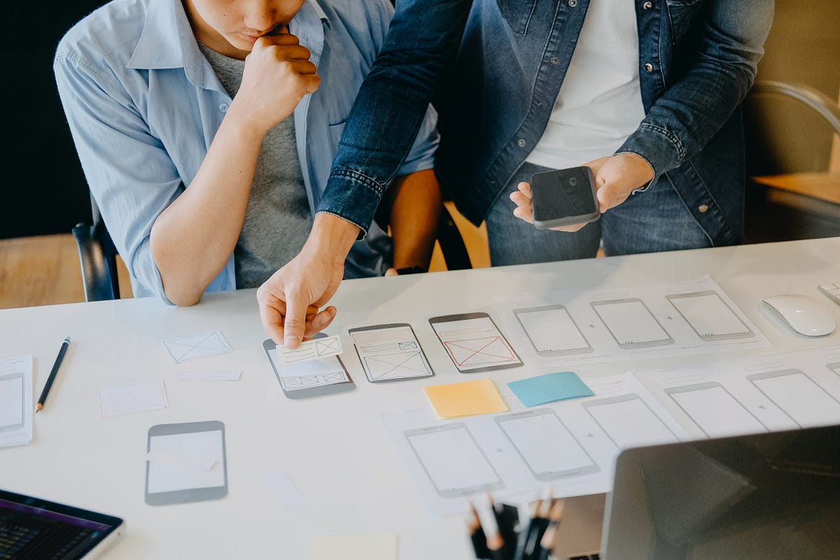
This gave us a nice bucket list to begin working on the redesign. Already knowing some "must have" and "nice to have" items going forward, we moved into a very low fidelity wireframing.
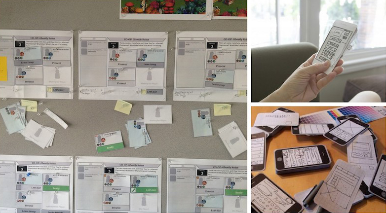
I also created some very basic visual elements, such as different logo lockups, buttons, images, text blocks, etc. on a large piece of paper and cut them out. During a few design sessions, we would move the cutouts around on the table, mocking a very large prototype of the site.
As the design started taking shape, I began working out how we would develop and deploy the new application.
Development
The current site was not using any time of framework or deployment procedure. They were still pushing code with FTP (not even SFTP!) and writing vanilla html, css, and javascript. There wasn't even any type of source control. Making sure you had the latest code was done by word of mouth. WORD. OF. MOUTH.
Coming fresh from a LAMP stack with Symfony at the School of Visual Arts in Manhattan, I was eager to use a PHP framework. I did some research into the current PHP framework landscape and did some Proof of Concept work with Laravel, Phalcon, and CakePHP.
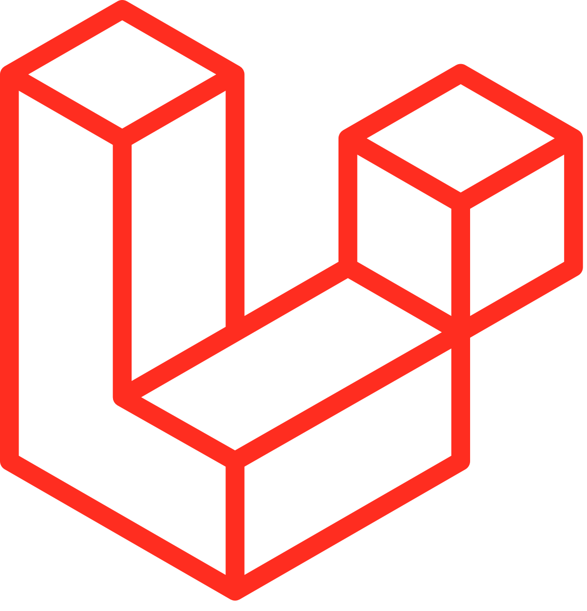
We were bootstrapping design and development, so as I worked on the design, I was getting an idea of the architecture we would need. I started writing out model schemas for the different data objects we would need, and their respective associations. This helped me land on using the Laravel framework. It was a little sister to Symfony. It had all the bells I needed and none of the whistles I didn't.
The last big step was determining how we would deploy the code. I decide on Capistrano, a tool written in Ruby, for that. I found a very early build I made, which I've pushed to Github here.
One key piece we wanted to add was an easy to use auto-suggest search feature. I had built something on a smaller scale at SVA. I Used Typeahead and Bloodhound to prop up the JSON parser and auto-suggestions.
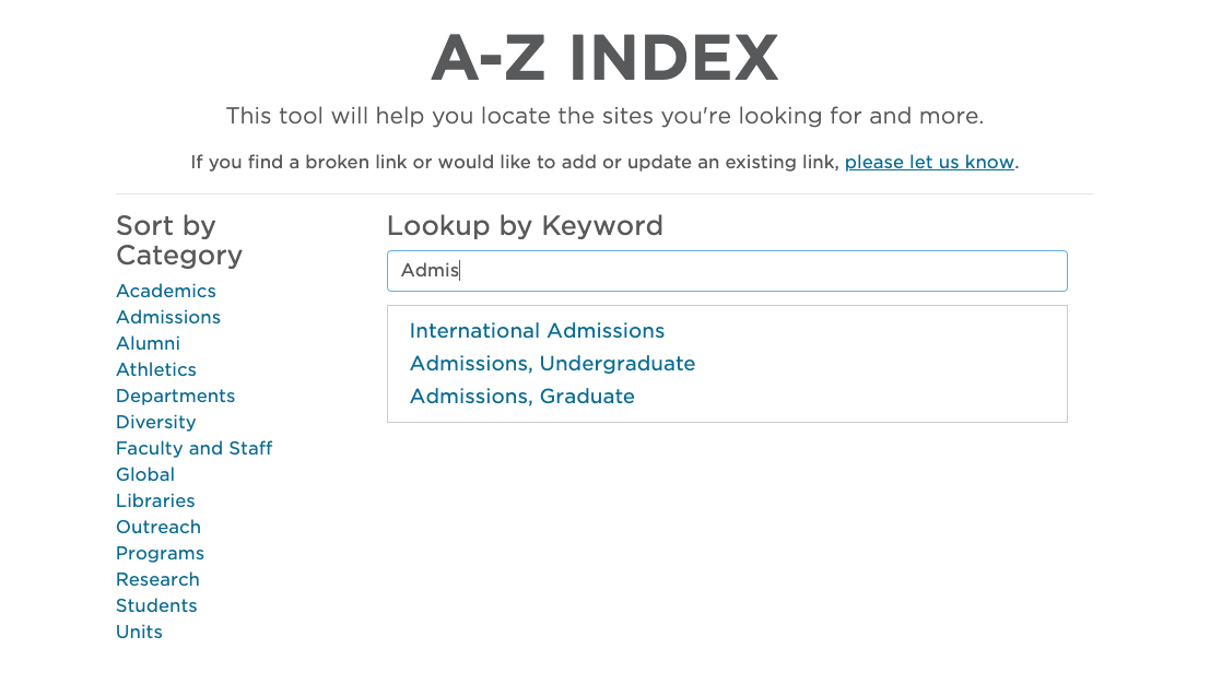
We used a cron to scrape keywords from the database, which packed them into a JSON file that was easily cached and parsable by Bloodhound.
Another new UX feature we wanted to bring to the site was a larger focus on the editorial space. At that time, we had some incredible writers crafting excellent stories for UT. They were getting international press, and not being highlighted anywhere on utk.edu. So I created the editorial splash page which would highlight a big story at UT.
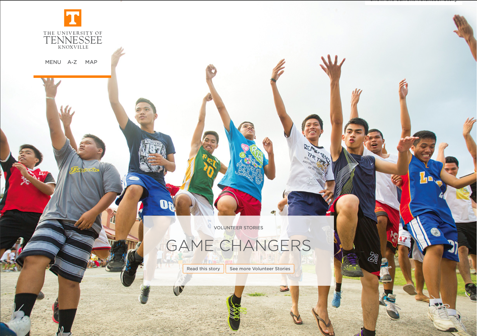
This not only boosted the parsable content on the site, but created a narrative for the great works at and around the university.
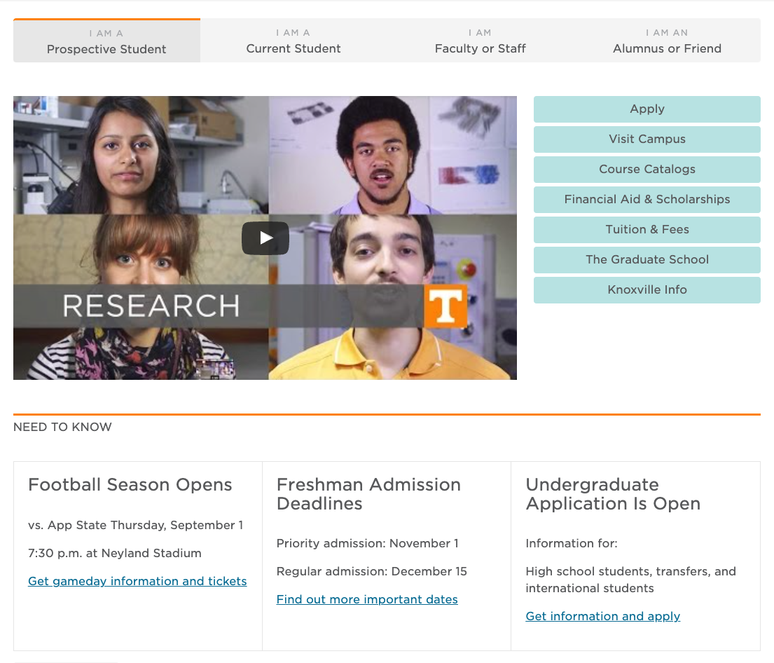
Last, but not all, I wanted to create user experiences for the different types of users. The feedback we got from User Testing made it clear there were people with exceptionally different missions when landing on the page. I wanted to make a smarter experience that would have very identifiable paths for each user, and curate the links, images, topics, stories, etc. based on that criteria. This was a crawl, walk, run mission, where we would build a somewhat static workflow at first, then roll in the smarter features.
Bringing it all together
Unfortunately, I never got to see the new utk.edu break into production. I received a job offer from Babel Street in August 2015 that I couldn't pass up.
Considering I had done the majority of the architecture, and others on the team were not proficient with Laravel or Capistrano, they went another route for the build and deployment. However, the gist of what we conceptualized was there on launch, albeit some things missing that were likely large technical hurdles.
My director, Leigh Shoemaker and teammate Mike Purdy did the communications circuit. The redesign received a great response, and the communications team continued to improve the experience.
I had a little accessibility experience prior to this project. At SVA, I had taken on the responsibility of adding ARIA attributes to their new site, and working to make a positive, successful experience for everyone. However, that work was always very technical, mainly adding code where a test told you it was missing. I didn't test it in the real world.
With the UT redesign, I got the opportunity to sit in a room with a blind twenty-three-year-old kid, watching him take the tests on each of the iterations we would build out. I observed the frustration of someone with a narrow cone of vision, frantically search for a button that should have been close to the contextual content, but had been placed on the other end of the screen.
Sometimes, we would tick all the technical boxes, 100% accessible score, but there were still pain points for the actual user. Getting to be involved in that process was absolutely incredible and galvanized my need to focus on accessibility in my future work.
No Chrome inspector tool, or plugin, or specification, can tell you exactly what you need to do. It's truly about the individual experience.END